Faux Bamboo Fetish – Dining Room Sideboard

I recently became obsessed with the look of vintage faux bamboo dressers, like those made by Thomasville or Henry Link in the 60s and 70s. These dressers have come back into fashion, repainted for a gorgeous new look. I see them on eBay and Etsy regularly, but with the shipping costs from across the country, it doesn’t seem quite worth it. I’m also nervous about taking on such a big project. As Ibie, whose dresser is in the second picture below, chronicles on her blog, the painting process on such a large piece is not for the fainthearted.

Here are some of the beautiful makeovers that caught my eye:

Callie's black dresser featured on Little Green Notebook

Callie’s black dresser featured on Little Green Notebook. I love the glossy black finish, and the rest of this room is fantastic, too!

Go to Little Green Notebook

Ibie's grey Henry Link dresser on One Story Building

Ibie’s grey Henry Link dresser on One Story Building. This looks so sophisticated and elegant! I certainly believe her that it was a bear to paint, though.

Go to One Story Building

I still have this project in the back of my mind, and I occasionally look around on Craigslist, eBay, and Etsy for that perfect dresser to repaint, but for now, I’m happy with an easier update to our old dresser. This is actually an inexpensive piece that we bought a decade ago. We almost got rid of it a couple of years back, but no one on Craigslist even wanted it, so we decided to repair all the sagging drawer bottoms, and I’m so glad that it has a new life as the sideboard in our dining room.

BEFORE: Old dresser we are using as a sideboard.

BEFORE: Old dresser we are using as a sideboard.

The hardware we had on there is a little rustic for our space, so I decided to give those old knobs a new life down at my dad’s beach house and replace the hardware with – what else – faux bamboo pulls! I chose this Belwith Bamboo Collection black nickel cabinet pull
, and there were several others out there that also look great, and I put some of my favorites on Pinterest.

Belwith Bamboo Pull

Belwith Bamboo Pull

Since the new pulls need two holes, I had to drill new ones. TIP: I used a piece of a piece of painter’s taped marked with the distance between the holes, so I could quickly measure and drill.

TIP: mark the distance between holes for cabinet hardware on a piece of painter's tape.  From Jewels at Home.

TIP: mark the distance between holes for cabinet hardware on a piece of painter’s tape.

And here’s the “new” old dresser. No, it’s not as stunning as an old Regency dresser painted in an elegant new color, but it was quick, easy, and inexpensive.

New faux bamboo hardware gives an old dresser new life.

New faux bamboo hardware gives our old dresser new life.

New hardware gives an old dresser new life.

20120803-202021.jpg

I’m happy with the result of this little project, and will still keep my eye out for something perfect.

“Jewels”


Perfectly-Mixed Traditional Dining Rooms

I recently put together a contemporary mixed dining space for my dad’s house, but there are many examples of beautifully eclectic traditional spaces as well.  As I mentioned in the previous post, the key is to balance contrast and connection between the diverse elements in a room.

Here are two examples from two of my favorite designers: Sarah Richardson and Candice Olson, as well as some pictures of our dining room at home.

Sarah’s House

This beautiful dining space has a modern take on many traditional elements, such as the wallpaper and Queen Anne chairs (remember when I repainted my Queen Anne chairs?).

Contrast:

  • The plush dining bench sits opposite – literally – to the wooden Queen Anne chairs
  • The trestle table has a simple, rustic style and dark color that give a strong foundation and sense of comfort to this light, glittery room.

Connection:

  • The grey color of the chairs reflects the overall light neutral palette of the room.
  • Both the bench and the chairs have an ornate, traditional feel, as does the chandelier.
Sarah's House Dining Room by Sarah Richardson

Sarah’s House Dining Room by Sarah Richardson

Go to Sarah Richardson Design

Divine Design:

Candice Olson has a great eye for beautiful things.  Her rooms always feel lush and complete to me.  This dining room design looks fairly simple, but there is so much beauty in the details.

Contrast:

  • The white and black palette provides instant contrast.
  • Candice used two different chairs at the table, with more substantial arm chairs at the head of the table.

Connection:

  • The black and white color scheme is carried through every part of this room, including the chairs, rug and curtains.
  • Even though the head and side chairs are different, they have a similar scale and shape to them, so they work together.
Candice Olson dining room featured in Elle Decor

Candice Olson dining room featured in Elle Decor

Go to Candice Olson’s website

Jewels’ house:

I also have a mixed dining set at our house, where I painted and reupholstered our Ikea chairs to work with a dining table from craigslist that I had fallen in love with.  I started out looking for cherry wood Arts and Crafts chairs, and I am so glad that I ended up painting our chairs black.

Contrast:

  • Black and cherry wood look beautiful together, without disappearing into each other or feeling heavy and overwhelming, as a more traditional wooden set can.
  • I have two traditional Chinese chairs at the head of the table, which is a perfect place to introduce something different.

Connection:

  • The chairs all tie together, because of their dark color and similar lines of the chair backs.
  • The Ikea chairs have a geometric cutout design detail on the back that is similar to the cutout design on the base of the cherry Arts and Crafts table.
Dining Room with painted and reupholstered chairs by Jewels at Home

Dining Room with new chairs. The head chairs are Chinese antiques, while the side chairs are transformed Ikea chairs. They all work together, because they share color and/or other design elements.

Dining Room with painted and reupholstered chairs by Jewels at Home

Dining room from the other side.

When you are looking for home decorating ideas, you can easily work with what you have by switching pieces of a dining set, slipcovering your chairs, or painting them for a fresh look.  Once again, I hope you feel inspired to create your own unique combination of elements in your dining space.  It can feel intimidating, but creating connections with shape, material, and color will help bring all the things you love together.

“Jewels”

Perfectly-Mixed (not Matched!) Contemporary Dining Spaces

A matched dining set is just fine. But sometimes, your chairs wear out, you come across the perfect table at a thrift store, you move house and your old things don’t fit… or you just want to create a fresh and creative look in your dining area. If you’re feeling inspired, look at these examples of mixed chairs and tables to see how you can create a space that is unique and beautiful!

You can make a big statement by using a furniture piece of a completely different style from the rest of the room, but usually, it works best to balance contrast and connection. That is, the contrast of different materials, colors, and forms creates visual interest, but connections, or common elements between pieces in the room will pull the look together.

Here are some examples that blend modern style with a comfortable, homey look. I look at more traditional spaces in a companion post.

Hanna’s Room

This is a fresh and airy dining area from Hanna’s Room.

Contrast:

  • The natural wood of the table stands out in a space that is otherwise all white.
  • Its simple straight lines form a backdrop for the curvy chairs.
  • The bare bulb pendants and modern white chairs feel crisp against the other soft, worn surfaces in the room.

Connection:

  • White is the obvious theme in this room, found in the walls, floor, curtains, chairs, and other accessories.
  • The wood table is simple enough that it doesn’t overpower the rest of the room, and the material ties into the wooden floor planks.
rustic table with modern chairs

This wooden table works perfectly in a clean white space by providing a contrasting material and color. Its clean lines fit with the modern design, and the wood relates back the painted wood floor. From Hanna’s Room blog.

Go to Hanna’s Room

Quiest-Brooke

Here’s another example of a mixed dining set using mid-century modern elements. The photo is from Quiest-Brooke

Contrast:

  • The warm red of the chairs contrasts against the distinctive white tulip table.
  • Both the red and white provide interest against the wooden floor and wooden sideboard.

Connection:

  • All the furnishings in this room have a mid-century style.
  • The round back and mid-century style of the chairs works perfectly with the tulip table and warms it up considerably from the cool space-age look of a complete tulip dining set.
  • The red color is echoed in the pot and vase, and the white blends with the white walls and ceiling.
tulip table with red chairs

This distinctive white tulip table was paired with red wooden chairs. The circular back of the chairs and the mid-century aesthetic tie them together. The chairs are a beautiful accent in this room. From Quiest-Brooke.

Go to Quiest-Brooke

Dad’s beach house:

The two rooms above were part of my inspiration in creating the dining space in my dad’s beach house. This home is built with modern straight lines, but with an emphasis on natural materials, like the mahogany trim. As a coastal vacation home, it should be warm and inviting, too. There are many wonderful sources for rustic wooden tables – flea markets, Craigslist, thrift stores, or furniture manufacturers that make tables from reclaimed wood. I ended up buying a new table that still has that aged look. It’s the Antique Honey Verona table from Cost Plus World Market. I like the trestle style for its looks and for easy of seating (no bumping up against the legs of the table!). You can see in the picture below that Cost Plus paired chairs with a bench, which is another great way to add interest to your dining set. It’s still a lot of wood in the same color, though, and the look is too heavy and rustic for our space.

Cost Plus World Market Verona dining set

Cost Plus World Market Verona dining set

I chose to pair this rustic table with Jake chairs from Room and Board. These are very similar to the ones in picture from Hanna’s Room. I’ve seen the same style for literally ten times as much money from other sources, but I couldn’t tell you why. I was inspired to add some color after seeing the red chairs in the picture from Quiest-Brooke, so I got the Jake chairs in coastal-inspired white and blue, with two orange chairs for a fun accent at the head of the table. I still haven’t decided of three different chai colors is too much, so I took some pictures with and without the blue chairs. I could spray those white. What do you think?

Jake Chair from Room and Board

Jake Chair from Room and Board

Here is the dining space in my dad’s beach house. I feel like it succeeded in blending modern features with a comfortable, coastal style. The chandelier is from West Elm. I don’t think the room needs anything more, though I might find or make a piece of art for the wall.

Contrast:

  • The antiqued wooden table adds a rustic touch to the new and modern space.
  • the orange chairs at the head of the table add interest next to the white chairs.
  • The modern lacquered chairs contrast with natural materials in the table, chandelier, and window trim.

Connection:

  • The wood table echoes the wood in the trim.
  • The chairs are all the same style, although they have different colors, and those colors are found in other parts of the room as well.
  • The chairs, table, and chandelier all refer to the ocean in the material, color, or form.

Eclectic coastal dining room by Jewels at Home

Eclectic coastal dining room by Jewels at Home

20120529-152145.jpgEclectic coastal dining room by Jewels at Home

Jewels’ house:

Although the style is completely different, I also have a mixed dining set at our house, where I painted and reupholstered our Ikea chairs. I talk about examples from that room and other more traditional spaces in the companion post: Perfectly-Mixed Traditional Dining Rooms.

I hope you feel inspired and emboldened to create your own unique and exciting mixed dining set. As long as some elements – shape, material, color – tie into your space, you’ll end up with a look that’s striking and cohesive.

“Jewels”

Easy Coastal Transformations for Ikea Dressers

My dad has a love of the ocean. He grew up spending summers at the beach, and it’s one of those memories that still stirs him. He’s downsizing his main home to a condo and invested in a getaway house near the ocean. A big part of his vision is to have our boys play on the beach the way he did, so I know we’ll be at the house a lot, too.

I’ve been charged with putting his house together, which at times has been a curse (construction project from &$@%!) but is, of course, also very exciting. I can’t deny I love a good decorating project and am fortunate to have this opportunity from my dad. And of course, since we’re by the ocean, I’d love to incorporate elements of a beach house into the design.

One of the many beautiful things the ocean gives us is the beautiful bleached grey patina of weathered driftwood. This dresser from West Elm caught my eye, because of the organic feel of the wood tiles and the fresh look of white against wood.

20120527-114310.jpg

West Elm prices are reasonable, but I had a whole house to finish, so I was hoping for a lower-priced option. What do you think when you think of inexpensive furniture? Ikea, of course! Ikea is a real mix of flimsy stuff that is barely worth the low prices and some really fantastic finds. For furniture, I try to stick with their solid wood pieces, which are sturdier and will last a lot longer than paperboard and foil. These Hemnes dressers definitely feel like they’re sturdy and a good value.
20120527-095211.jpg
One of the current finishes at Ikea is this gray-brown, which I think has the look of driftwood. The super-easy trick I used was to buy two Hemnes dressers in white and two in grey – all for the price of one dresser from West Elm. I then swapped the drawers between the two sets, and tada! Instant coastal charm with a clean look that will endure!

A simple swap was all I needed for the master bedroom dressers, and the white matches the West Elm Window Headboard perfectly.

Ikea Hemnes dresser hack - swap the drawers for a coastal transformation. By Jewels at Home

White dresser with gray-brown drawers in the master bedroom.

Ikea Hemnes dresser hack - swap the drawers for a coastal transformation. By Jewels at Home

For the kids’ bunk room, I wanted to use a surfing theme, so I painted surfboards on the drawers. The designs were taken from some of the bedding in the room. This is a fun coastal look that is great for young kids and still works for teens.

Gray-brown Hemnes dresser transformed with painted white drawers. By Jewels at Home.

Gray-brown Hemnes dresser transformed with painted white drawers in the boys’ bunk room.

Gray-brown Hemnes dresser transformed with painted white drawers. By Jewels at Home.

Gray-brown Hemnes dresser transformed with painted white drawers. By Jewels at Home.

How to:
To paint the drawers, I sanded the drawer fronts lightly and sprayed them with white primer. I painted the surfboards with acrylic craft paints then sprayed a clear finish on top.

By the way, I realize not everyone needs multiple dressers, but you could swap with a friend or just paint the drawer fronts for the same effect. It was easy to work with the panels before I assembled the drawers.

Hope you’re getting the calm feeling of the beach from these easy and inexpensive dresser makeovers!

“Jewels”

I shared this post at:

Powder Room Reveal – Tiny Silver Gem

I am so pleased to finally show you our new powder room! It took longer than I anticipated, but it turned out just as I hoped. I used lots of silver in this small space, to make it feel brighter.

Powder Room by Jewels at Home 1

The finished powder room has lots of bright and elegant details, like the Imperial Trellis wallpaper and new chair rail.

We did not want the hassle or the expense of a full renovation, so I did not take out the walls or floor, even though they were far from perfect.  I worked with what we had and

I’m very happy with the result. Before, the room felt unfinished (because, as hubby points out, it was unfinished) and plain. I  would actually avoid it and go upstairs to a “real” bathroom. Now, it’s still small, but it feels polished and pretty, and I occasionally peek in just to take a look (okay, that won’t go on for long, I hope).

Vanity area before

BEFORE: The whole room was very white – blah – with dated gold-tone fixtures.

I got the help of a handyman to change out the old pedestal sink for this new vanity.  Our half bath is very small, so I looked for a long time to find a small vanity that didn’t feel undersized.  I am happy with the look and functionality of this Covus vanity found on Overstock.  The new towel bar and toilet paper holder add a shiny touch in polished chrome.  The art is a print from an Henry Evans calendar (more of those to see in upcoming posts, too).  I picked the color of the flower and picture mat to tie in the old floor colors.  The frame was a thrift store find and brings more silver into the room.

Here are some more views of the finished room:


Powder Room by Jewels at Home

Powder Room by Jewels at Home 3

Powder Room by Jewels at Home

I’m very relieved to have this powder room off the to-do list.  It was getting embarrassing!  Now, I can get on to some more fun projects that I’ll post soon.

“Jewels”

Stenciling on Fabric – Lampshade and Pillow

Have you seen these fabulous pendant light drum shades at Room and Board? I’ve been drooling over them for years, with all the gorgeous prints and colors. They’re a splurge at several hundred dollars a shade, but they are really beautiful. Go check out all the beautiful and funky prints they have!

Zinnia Cool Pendant

Galbraith & Paul drum shade from Room and Board in Zinnia Cool pattern.

As always, I was wondering if I could make something like this myself, and in browsing ideas, I found some great examples, including this one from Laura at Some Kind of Lovely Ride. She did a beautiful job on her shade and had great instructions that helped me conquer my apprehension about this project!

laura's lamp

Yellow floral stencils on a lampshade by Laura at Some Kind of Lovely Ride. A perfect DIY inpsiration!

I was so excited to get started, I rushed to the craft store to pick up my supplies and get to work! I stenciled the lampshade in my craft studio and while I was at it, I also stenciled a piece of fabric for a throw pillow. I used Laura’s basic instructions and discovered a few tips along the way, so here’s how it went:

Supplies:

20120517-164054.jpg

Supplies for stenciling on fabric.

  • Stencils – I used Mini Peony and Mini Mums by The Crafter’s Workshop.
  • Stencil brushes or sponges – These sponge “pouncers” are inexpensive, easy to use, and washable for reuse.
  • Paint – I had a variety of acrylic craft paint around, and I did mix some to get the colors I wanted. It’s optional, but I also added some “textile medium” to my paint, which makes the paint more flexible when dried. This wouldn’t be an issue for the shade, but I thought it would help on the pillow. I mixed the paints in paper bowls.
  • Tape – I used painter’s tape to hold the stencil in place and mask off any areas of the stencil I didn’t want to use.

Stenciling

Basic stencil:

  • Tape the stencil securely in place
  • Put a small amount of paint on your pouncer. If you load on too much paint, it will run under the stencil and smudge your pattern.
  • Lightly dab through the stencil, moving only up and down. Don’t brush side to side, as this will also make paint run under the stencil.
  • Carefully remove the stencil and blot the back on a clean piece of paper to remove any excess paint
  • Repeat!
20120517-164124.jpg

Tape your stencil in place and lightly dab on the paint.

Adding a color:

  • Wait until the first color is completely dry.
  • If you are going to overlap designs, like I did, think ahead about which color you want to be “on top” and start with the colors that are on the bottom.

Finishing the fabric:

  • This is not necessary for a shade, but for a pillow or other fabric that will be touched and possibly washed, you’ll want to set the paint. When the paint is thoroughly dry, iron the stenciled fabric from the reverse side with a dry iron on medium-high for three to five minutes to set the colors. You can repeat this on the front, laying a thin cloth over the stenciled fabric, so the paint doesn’t stick to your iron.

Finished stencils!

Here is how the shade looked before:

20120517-164114.jpg

A simple drum shade. Pretty, but I wanted to add some color!

And here’s the finished shade:

20120517-164139.jpg

Drum shade transformed with floral stencils in blue, green, and silver. I dare say, I like this better than the inspiration shade!

20120517-165842.jpg

The random pattern of stencils gives a different look from every side. And it makes it easier, because you don’t have to worry about lining up the pattern.

20120517-213651.jpg

Lit up at night. No, I’m not tired of looking at it. Can you tell?

Here’s the finished fabric. I’ve got a lot of pillow projects lined up, so I should work on those soon!

20120517-164150.jpg

The stenciled fabric, on the bottom, will be a throw pillow for the daybed. The colors coordinate with the hydrangea print paper I found. I’m making desk accessories and some other projects with the paper.

“Jewels”

This project is shared at:
The Shabby Nest

Painted Gold Stripe Tray {by Ari}

DIY decorating projects aren’t just great for saving money. I love the feeling you get when create something that is exactly your vision and absolutely unique. And it’s even more fun when you can share the experience and results with friends. I’m so pleased to introduce you to Ari, my friend, neighbor and fellow working mom/ lover of crafts and decorating. We’ve worked together on quilts for the school fundraiser and shared great times painting furniture and antique hunting. Recently, she got the inspiration to paint decorative trays, and I caught the bug, too.

We picked up some old trays at the flea market last week, and Ari wasted no time getting to work! Here’s the tray she started with, which is one if a pair she picked up for $15 total.

20120514-110324.jpg

This play tray has a cool mid-century feel, but it’s definitely plain. Just wait until Ari works her magic!

Using an inspiration she had found, which is included in my earlier post on ideas for decorating trays, she decided to paint gold stripes on it for her dining room.

To start, she painted the inside of the tray with a base of white and let that dry overnight. Then she used blue painter’s tape to mask off this great stripe pattern. Chevron and zig-zag patterns are so popular right now, and this is a great play on that idea, without feeling overly trendy. There are metal corners on her tray, so she masked those off, too.

20120514-110735.jpg

Use blue painter’s tape to mark off your pattern. This is a nice play on the popular chevrons and zig-zags.

Now for the fun part, she sprayed the entire tray with metallic gold spray paint. After letting it dry thoroughly, she removed the tape, and WOW! I can hardly recognize that plain old tray. The result is so sophisticated and will look great in the dining room.

20120514-111312.jpg

A glamorous transformation for a flea market find. The gold really shimmers and the stripe pattern is so sophisticated.

We have more big plans for decoupage and stencils on trays. I’m also thinking this technique would look great on a wooden box. Come back soon to see how everything turns out.

“Jewels” and {Ari}

Creative Banners and Cupcakes for a Cause

Bake sale! Don’t those words just conjure all good things? The smell of fresh baked treats, hanging out with friends at the sale table, raising money for a good cause… add to that the fact that I was asked to make some crafty signs to advertise our bake sale, and I am in heaven!

For the past four years, a group of my coworkers and our friends have formed a team for the Avon Walk for Breast Cancer. I’ve always been excited by this event, but I was hesitant to join – partly out of the logistical hurdles of training and walking with small kids at home – and partly out of a fear that after working with people with cancer in my job and having lost my mom to breast cancer, participating in this event might lead to emotional overload. I can’t explain why, but for some reason, this seemed like the year that I wanted to make the Avon Walk a part of my journey.

As part of our fundraising and team-building, we are holding a bake sale this year. If you are in San Francisco and can come by the UCSF Cancer Center at 1600 Divisadero Street tomorrow (Friday, May 11, 2012) from 12-3, you can support our team and taste what I guarantee will be a delicious array of treats. We will be outside the cafeteria on the lower level.

The Signs:

These were certainly not works of art, since I threw them together at the last minute, but I still had fun with the design. I had some cake-themed papers from a large pack, so those were the inspiration for the colors. Of course, the pink also tied in to the Avon and breast cancer awareness colors.

I made the cakes stand out from the poster by folding a paper “spring” on the back. And the little pennants give a sweet homemade flavor, just like our desserts!

bake sale banner

I hope our homey bake sale signs with the cheerful pennants attract lots of hungry customers!

The Goodies:

The slight incongruity of selling sweets to raise money for a health-related cause has not escaped me. While I will no doubt be indulging in the brownies and truffles some of my friends have planned, I decided to offer a slightly healthier option, with the banana bread recipe my mom used when I was little. This recipe is in a notebook she gave me when I got married. It has a lot of our “comfort” recipes from childhood and blank pages to record my own. I’m so very glad I have this book. I’m sure it’s just the description she transcribed from the magazine or recipe book, but the sentence “Very ripe bananas and slow cooping are the secret of this banana bread” makes me feel like my mom is sharing a secret just for me.

recipe book

I love seeing my mom’s handwriting in this recipe notebook she gave me when I got married.

Banana Bread:

Very ripe bananas and slow cooking are the secret of this bread.

4 medium very ripe bananas

1 1/4 c sugar

1/4 tsp salt

4 1/2 tsp baking soda

4 eggs

3 1/2 c flour (I mix some whole wheat in)

1/2 c oil (you can use butter for a richer taste)

2/3 c buttermilk (you can substitute yogurt or add a tablespoon of vinegar per cup of regular milk and let the milk sit for five minutes)

Peel very ripe bananas. Combine with sugar, baking soda, and salt. Beat at high spee for 1 minute (can use blender)

Mix in eggs, one a time; then mix in flour

Add oil and buttermlk Combine and beat for 2 minutes

Divide batter into two loaf pans

Bake in preheated 275F oven for about 1 3/4 hours

It’s hard to get a lot of very ripe bananas, at least in this house, because they keep getting eaten. This recipe calls for four, so if we have one or two overripe bananas, we put them in a bag in the freezer to save up until we have enough for banana bread or hubby’s amazing banana waffles.

The new thing I’m trying this time is chopping some of the bananas into chunks and folding them in at the end with the chocolate chips. I had banana bread from Tartine Bakery on Guerrero, which I think is very possibly the best bakery in the city, the other morning that had the small chunks in it, and they were caramelized and delicious!

chunks of banana

Chunks of banana mixed into the batter for a fruity flavor and sweet caramelized morsels.

I love this bread with walnuts and chocolate chips, but we appear to be out of walnuts tonight, so I will have to “make do” with chocolate chips only. Hubby recently articulated that he thinks nuts ruin baked goods, while I think they make them – they’re crunchy, rich, and I love the bit of bitter taste of walnuts against the sweetness of a cookie… obviously he’s wrong, right? He did make me a batch of chocolate chip cookies with nuts for my birthday, and he presented them to me, saying, “I put nuts in these, even though I don’t believe in it.” That’s love.

Sweet dreams!

“Jewels”

Ikea Dining Chairs All Grown Up – Craftsman and Regency Makeovers

No doubt it’s lovely to buy something new for your house, but it can also be fun when furniture you have had for a long time takes on new forms and uses.

Hubby and I first bought these chairs from Ikea thirteen years ago when we were living on the other side of the continent. There were four of them in birch with white seats around a small matching kitchen table in our apartment. Over the years, we accumulated more from Ikea and then through Craigslist, when Ikea stopped making them. Our collection of twelve chairs has moved across the country and through several houses with us. They’ve held up wonderfully as our everyday dining chairs for thirteen years!

I can’t dig up a good picture of the way the set originally looked, but I’ll keep an eye out for it. Meanwhile, I found this old stock photo on the internet.

original ikea chair

This is the original chair we bought from Ikea in birch, tough ours had white seats. I can’t remember its cute Swedish name, but I think it started with “A.”

Ikea borje chair

Ikea Borje chair.  A current model that has a somewhat similar look.

The cute birch table with a glass top met an untimely end (long story), and we replaced it with an Arts and Crafts/ Craftsman/ Mission style cherry wood table. At that time, I put slipcovers in the chairs, since they didn’t match.

Arts and Crafts Makeover:

Three or four years ago, I was shopping for chairs to go with the Arts and Crafts style dining table, when I realized the solution was right beneath my nose! I still liked the elegant geometric lines of the Ikea chairs, which I think are reminiscent of Frank Lloyd Wright, perhaps the most well known architect of the Arts and Crafts movement. It was just the light color of the wood that didn’t work. Staining the chairs would have involved stripping the finish and trying to match the color. Even if i had been able to do that perfectly – and that is not likely – the grain of the woods would still not have matched.

In any case, it really isn’t necessary to have chairs that match your table – nor nightstands that match your bed. It actually looks so much more interesting to mix and match. The chairs at the head of our dining table are not the same as the side chairs, either, and I feel it all works together.

So, our chairs that started as Scandinavian modern evolved to Arts and Crafts with new black paint (tips on painting in an earlier post) and tan microfiber suede seats. Microfiber suede, also called faux suede or ultrasuede, has a nice soft texture but is extremely durable and washable – I have scrubbed these seats with a soapy kitchen sponge on more than one occasion, and they end up looking as good as new. There are microsuedes intended specifically for upholstery that have a backing to give this soft material a lot more structure. If you can find this, it’s highly recommended! Four of the chairs with the tan seats are at our games table, which is our original cherry dining table, in the family room.

ikea to arts and crafts

The first makeover: I adapted our modern Scandinavian chairs to go with an Arts and Crafts style table by painting then black and adding tan faux suede seat fabric.

games table

A round games table in the family room is perfect for art projects and board games with the kids. The tan microfiber seats hold up very well!

Regency Makeover:

We move way too often, but I do like the opportunity to change the design of our rooms. We still have some great Arts and Crafts furniture, but I wanted to brighten up our home and incorporate more contemporary and Asian elements. It’s still a work in progress, but I’m trying to develop a bit of a Hollywood Regency/ Chinoiserie feel in our new living-dining room, and I love that these familiar old chairs have been able to come along for the ride.

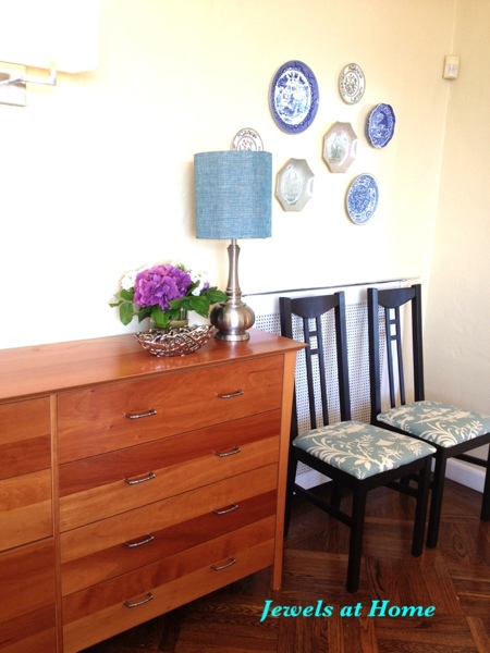
So, in our current home, I’ve changed the seats on the majority of the chairs to a whimsical Chinoiserie print in blue and cream: Robert Allen Lake Paradise in spa, an outdoor fabric that’s durable and wipeable. These are chairs that are used daily – including by the kids – and I just didn’t think that ordinary fabric would hold up. The polyester is not as soft as a nice upholstery cotton, but our bottoms haven’t minded. I showed how to upholster the seats in earlier post. Start looking around, and you’ll find that outdoor fabrics now come in almost any color, pattern, or texture. Many great fabric designers have beautiful prints meant to stand up to the outdoors, often including some of the same patterns they have in their indoor collections and more!

ikea to regency chair

Another step in the evolution of our old Ikea chairs. This new fabric gives them an elegant yet whimsical feel that fits in with the Chinoiserie/ Regency look I am working on in our living-dining room.

Dining Room with painted and reupholstered chairs by Jewels at Home

Dining Room with new chairs. The space is still a work in progress.

Dining Room with painted and reupholstered chairs by Jewels at Home

Dining room from the other side. I’m happy with the wallpaper inside the shelves.

The dining room is starting to come together. I do like how the Imperial Trellis silver wallpaper looks inside the bookcase. Now that I look at the collection of plates again, I think I could use a couple more. I also want to make over or replace the sideboard. My fantasy is to find an old Thomasville or Henry Link Bali Hai dresser with faux bamboo accents to repaint for that area. And most of all, I would love to change the fireplace mantel. It is plaster with a cheesy faux marble finish, and there are two disembodied heads that stare out at you! Part of me wants to take the whole thing out, but since it’s historical, I might keep it and try to remove the heads and repaint it. I’d also like to do a few small projects like recover or replace the cushions on the head chairs, sew a runner for the sideboard, work on accessories, etc.. Well, one thing at a time. I’m having fun every step of the way!

“Jewels”

DIY Decorative Trays – Ten Great Ideas

Ten Trays

The best decorating projects combine form and function – they add beauty to your space, serve a purpose, and when you make your own, they are one of a kind! A decorative serving tray is just this kind of project. You can use them to display or transport items on a coffee table, buffet, desk, kitchen counter, and more.

My friend Ari got me excited about decorating our own trays when we were at the flea market this past weekend. I picked up an older wooden tray there for just $5, and I know I have a couple of my own lying around the house. I want to use some for display in the living and dining room, and one for the desk in my craft room. There are so many great ideas, and here are some I would love to try or adapt for myself.

Silhouette and Silver

Silver leaf tray

The botanical silhouette and silver leaf on this tray are beautiful.

Brenna at Design Sponge has a tutorial for how she made this tray from a thrift store find! You could simplify it for a similar look with silver spray paint, though the silver leaf looks amazing, and the glass makes the tray useable for serving.

Monogram

monogram tray

Lots of options to personalize a monogram tray from A Modern Style on Etsy.

This one is by A Modern Style on Etsy. I love the bright colors and graphic design contrasted against the wood.

Wallpaper and Lacquer

Lacquer wallpaper trays

Gorgeous lacquered trays with wallpaper inserts and bold colors from iomoi.

This is from iomoi and hand lacquered, so it would be very durable and stand up to washing and heavy use. The coordinating colors on the body of the tray and the gold trim are gorgeous! I could use some more of the Imperial Trellis wallpaper I have left over from our powder room and lining our bookcases.

Painter’s Tape and Paint

painter's tape tray

Use painter’s tape to mask a design on a plain tray (or paint the tray a background color first). Follow with spray paint – looks great in metallic for a striking graphic design.

Courtney Kaye of Courtney on the Brink made these trays for holding jewelry. They look bold and elegant! I’ve been using metallic spray paint for a lot of projects recently, and I love it!

Tile Mosaic

tiled tray

A tile mosaic looks beautiful inside this tray.

This beautiful example, as well as instructions for tiling the inside of a tray, are from the Martha Stewart.

Frame and Fabric

This is an idea to make a tray from a frame and cabinet handles. You can put fabric or pretty paper under the glass.

Patrice from Lemon Tree Creations had this creative idea for making a tray from a frame and cabinet handles. The glass protects the decorative fabric or paper.

Stencil

Stenciled Tray

This stenciled tray is so elegant. I love the painted grey exterior with the white and grey graphic design.

The instructions for stenciling this tray are from HGTV.  Of course, it looks so much like my Imperial Trellis wallpaper, that I could use that for the same look, but there are other great stencil ideas out there, including stenciling words.

Paper Mache

Paper Mache Tray

A sweet little tray made from paper mache and painted different colors inside and out.

Start from scratch! The instructions for making this paper mache tray are at Everything LEB. I love how she used metallic paint inside and the sweet green-blue on the outside.

Decoupage Circles

decoupaged tray

These cute circles have text from old books on them. You could do the same with all sorts of fabrics, papers, and shapes.

A fun and unique example of decoupage from iHanna. There are so many great ways to build on this idea!

Photographs

photo tray

This photo in sepia tones looks beautiful mounted inside a tray.

You could print a single large photograph or several small ones and decoupage them to the inside of a tray and/or mount under glass. This lovely example is from Merle Hillary Interiors.

All these projects would be a perfect way to re-use a tray you already have or give new life to a thrift store or garage sale find. There are also new trays that would work well for makeovers. Here are two very different examples:

Glam Base

west elm trays

These lacquered trays from West Elm are already gorgeous. You could dress them up in so many ways!

If you want a tray that is already beautiful on its own, these trays from West Elm are a great option. With a simple design and so many colors to choose from, they would also be easy to customize. Only trick I foresee is that it might be a little tricky to get things to adhere well to the lacquer.

Simple Base

For a simple unfinished wood base, try this  Walnut Hollow Unfinished Wood Serving Tray, 15-inch x 11-inch.

Well, that’s my roundup of inspirations for trays to make yourself. I hope Ari and I can find some time soon to work on ours!

“Jewels”