Decorative Pillows to Sew – Idea Book

Inspirations for Pillows

Happy Mother’s Day! (Well, for many years, I didn’t find this day happy at all, because it made me feel my mother’s absence even more, but with three little ones of my own, it is happy again, and I celebrate the many wonderful memories of my own mom, whose creativity and talent are constant inspiration for me. So, if this is a hard day for you, hugs! And I hope it will get better.)

I’m making some throw or accent pillows for our home. Sewing straight lines is a doable project for me, and I like to make pillows using some of the same fabrics that are in other parts of a room (such as the upholstered chairs in our dining room and my craft room), to tie the space together.

With a beautiful fabric, a very simple pillow design will work well. There are also many ways to add interest and details to your pillows, and I’ve been collecting some of those ideas to try:

Embellish with Ribbon:

Ribbon motif pillows

By Caitlin Wilson Textiles. Click the picture for details.

grosgrain ribbon pillow

I like this pattern shown at Better Homes and Gardens. They used fusible web to attach the ribbon. Click the picture for more pillow ideas on their website.

These ribbon details on simple pillows gives a classic and elegant feel. You could also do a simple square.

Use Contrasting Fabric on Back:

reversible throw pillows

I love the look of a different color on the front and back. This picture is from Grosgrain, where Kathleen has some tips on making a quick pillow cover.

Embellish with Buttons:

button pillow

Add a letter or other pattern with buttons. This is a beautiful example by Peggy at Letter Perfect Designs on Etsy. (And I’m not just saying that, because it’s a “J”!) Click the picture to see more beautiful button art!

3-D Felt Embellishments:

butterfly pillow

These three dimensional felt butterflies are so sweet! Click the picture to see the tutorial from Better Homes and Gardens.

Piping/ Welting:

pillow with piping

This pillow is made by Weego Home. Click on the picture to see their stunning collection.

A stunning print like this would be beautiful on its own, but I love the piping detail. Here’s a tutorial on eHow for applying store-bought welting or piping. I’d love to learn how to do that!

Silhouette:

silhouette pillow

This incredible pillow by Weego Home is cut velvet appliqued on linen. I think you could get a similar look with painting on fabric, though obviously, it won’t have the rich feel of this original. Click to see their collection.

Pieced Pillow:

pieced pillow

I like the use of panels made from two fabrics, especially the way it is asymmetrical. This pillow is from Anthropologie, though it is no longer sold.

These are some of my favorite ideas – what are some of yours?

Hope to post my new pillows soon!

P.S. Don’t forget that there’s a May Giveaway. Comment on any post by May 15, and I’ll select a winner to receive a custom wall initial.

“Jewels”

Shoebox Makeovers – Mani-Pedi Kit and Decorative Box

I’m lucky to have a sister for so many reasons – she’s the one person with whom I can be completely myself and share all the funniest and saddest moments. As a fun bonus, little sis loves designer shoes, and I get the beautiful boxes!

Today is definitely TGIF. Work was busy this week, and I’m ready to shift gears for the weekend. Tomorrow is our school’s annual dinner, and I love the chance to get dressed up and enjoy some time with friends. I don’t get fancied up often, but I decided to paint my nails tonight and was reminded of how easy and fun it was to decorate this shoebox to organize my nail polish and accessories.

Easy mani-pedi kit made from an old shoebox.

Easy mani-pedi kit made from an old shoebox.

Mani-pedi kit inside

There’s enough room for nail polish and accessories. I love the damask lining of this box. You could add your own to a sturdy plain box.

This box was already lined in that pretty metallic damask, but you could glue in a paper or fabric liner to any sturdy box. I used a ribbon and some stickers on the outside to cover up the printing, and now practical little me gets to feel girly and pink once in a while.

shoebox decorated for display.

This beautiful shoebox has a ribbon closure. I added scrapbook paper to the outside.

Another of my sis’ shoeboxes is in our living room. This time, I glued some scrapbook paper over the printing, and it’s ready for display. (Yes, putting photos in frames is on my to-do list!). The style of this box, with the attached lid and ribbon closure gave me the idea to cover some extra test kit boxes from work. Hope to show you that soon.

Okay, now go raid your (sister’s) shoe closet and create your next project!

“Jewels”

Ikea Dining Chairs All Grown Up – Craftsman and Regency Makeovers

No doubt it’s lovely to buy something new for your house, but it can also be fun when furniture you have had for a long time takes on new forms and uses.

Hubby and I first bought these chairs from Ikea thirteen years ago when we were living on the other side of the continent. There were four of them in birch with white seats around a small matching kitchen table in our apartment. Over the years, we accumulated more from Ikea and then through Craigslist, when Ikea stopped making them. Our collection of twelve chairs has moved across the country and through several houses with us. They’ve held up wonderfully as our everyday dining chairs for thirteen years!

I can’t dig up a good picture of the way the set originally looked, but I’ll keep an eye out for it. Meanwhile, I found this old stock photo on the internet.

original ikea chair

This is the original chair we bought from Ikea in birch, tough ours had white seats. I can’t remember its cute Swedish name, but I think it started with “A.”

Ikea borje chair

Ikea Borje chair.  A current model that has a somewhat similar look.

The cute birch table with a glass top met an untimely end (long story), and we replaced it with an Arts and Crafts/ Craftsman/ Mission style cherry wood table. At that time, I put slipcovers in the chairs, since they didn’t match.

Arts and Crafts Makeover:

Three or four years ago, I was shopping for chairs to go with the Arts and Crafts style dining table, when I realized the solution was right beneath my nose! I still liked the elegant geometric lines of the Ikea chairs, which I think are reminiscent of Frank Lloyd Wright, perhaps the most well known architect of the Arts and Crafts movement. It was just the light color of the wood that didn’t work. Staining the chairs would have involved stripping the finish and trying to match the color. Even if i had been able to do that perfectly – and that is not likely – the grain of the woods would still not have matched.

In any case, it really isn’t necessary to have chairs that match your table – nor nightstands that match your bed. It actually looks so much more interesting to mix and match. The chairs at the head of our dining table are not the same as the side chairs, either, and I feel it all works together.

So, our chairs that started as Scandinavian modern evolved to Arts and Crafts with new black paint (tips on painting in an earlier post) and tan microfiber suede seats. Microfiber suede, also called faux suede or ultrasuede, has a nice soft texture but is extremely durable and washable – I have scrubbed these seats with a soapy kitchen sponge on more than one occasion, and they end up looking as good as new. There are microsuedes intended specifically for upholstery that have a backing to give this soft material a lot more structure. If you can find this, it’s highly recommended! Four of the chairs with the tan seats are at our games table, which is our original cherry dining table, in the family room.

ikea to arts and crafts

The first makeover: I adapted our modern Scandinavian chairs to go with an Arts and Crafts style table by painting then black and adding tan faux suede seat fabric.

games table

A round games table in the family room is perfect for art projects and board games with the kids. The tan microfiber seats hold up very well!

Regency Makeover:

We move way too often, but I do like the opportunity to change the design of our rooms. We still have some great Arts and Crafts furniture, but I wanted to brighten up our home and incorporate more contemporary and Asian elements. It’s still a work in progress, but I’m trying to develop a bit of a Hollywood Regency/ Chinoiserie feel in our new living-dining room, and I love that these familiar old chairs have been able to come along for the ride.

So, in our current home, I’ve changed the seats on the majority of the chairs to a whimsical Chinoiserie print in blue and cream: Robert Allen Lake Paradise in spa, an outdoor fabric that’s durable and wipeable. These are chairs that are used daily – including by the kids – and I just didn’t think that ordinary fabric would hold up. The polyester is not as soft as a nice upholstery cotton, but our bottoms haven’t minded. I showed how to upholster the seats in earlier post. Start looking around, and you’ll find that outdoor fabrics now come in almost any color, pattern, or texture. Many great fabric designers have beautiful prints meant to stand up to the outdoors, often including some of the same patterns they have in their indoor collections and more!

ikea to regency chair

Another step in the evolution of our old Ikea chairs. This new fabric gives them an elegant yet whimsical feel that fits in with the Chinoiserie/ Regency look I am working on in our living-dining room.

Dining Room with painted and reupholstered chairs by Jewels at Home

Dining Room with new chairs. The space is still a work in progress.

Dining Room with painted and reupholstered chairs by Jewels at Home

Dining room from the other side. I’m happy with the wallpaper inside the shelves.

The dining room is starting to come together. I do like how the Imperial Trellis silver wallpaper looks inside the bookcase. Now that I look at the collection of plates again, I think I could use a couple more. I also want to make over or replace the sideboard. My fantasy is to find an old Thomasville or Henry Link Bali Hai dresser with faux bamboo accents to repaint for that area. And most of all, I would love to change the fireplace mantel. It is plaster with a cheesy faux marble finish, and there are two disembodied heads that stare out at you! Part of me wants to take the whole thing out, but since it’s historical, I might keep it and try to remove the heads and repaint it. I’d also like to do a few small projects like recover or replace the cushions on the head chairs, sew a runner for the sideboard, work on accessories, etc.. Well, one thing at a time. I’m having fun every step of the way!

“Jewels”

Silver Spray Paints – DIY Apothecary Jar and Painted Screen

Spray paint itself is an amazing product – goes on quickly and evenly for a smooth finish. Metallic spray paint takes the level of wonder a step higher. I have been experimenting with two paints from Krylon’s Special Purpose Metallics line that I found at our neighborhood hardware store, and I think I’m addicted!

Dull Aluminum (1403) is what I used on the little box from the rummage sale. Despite its name, I don’t find it dull. It gives a cool grey/silver finish that looks like it’s painted – okay, I know that sounds obvious, but I mention it in contrast to the Bright Silver (1401), which looks more like a real metal finish.

metallic spray paints

Projects using Krylon “Dull Aluminum” and “Bright Silver” paints.

Here are some projects I’ve tried with each, and I’m already thinking about what to do next. Let me know if you have suggestions!

Bright Silver Paint
I’ve been trying to find more projects that reuse old things. Recycling is great, but it still uses a lot of energy and produces waste. Reusing is good for our planet and our pocketbooks, too! The challenge is to find projects that reuse old items but don’t look like a preschool art project!

This idea for a DIY apothecary jar is not original to me. I’ve seen it in several places, including Parties for Pennies.

DIY apothecary jar

DIY apothecary jar made from a used jar, a cabinet knob, and metallic spray paint.

You will need:

  • glass jar with lid
  • cabinet knob with bolt
  • washer
  • drill
  • sandpaper
  • spray primer
  • metallic spray paint
  • clear finish spray

1. Sand the lid to roughen it up for the paint to stick.

2. Drill a hole in the center of the lid

3. Insert the the bolt and washer from under the lid and screw on the knob

4. Spray primer, then paint (2 coats), and seal with a clear finish. Let each coat dry before continuing.

20120507-182007.jpg

Another view of a DIY apothecary jar made from a used jar, a cabinet knob, and spray paint.

It’s such a creative and satisfying project. We use jars all the time, and I have a ton of knobs leftover from replacing the dated brass and black ones in our kitchen, so I’m thinking of making lots of these as gifts!

Dull Aluminum Paint

I used this paint on a couple of projects recently. This is actually a pretty silver-colored paint; I don’t like the word “dull” in it’s name! The first was for painting this box I picked up for five dollars at a rummage sale:

side table styling

This dull old box was painted silver with Krylon Dull Aluminum paint and looks beautiful in our living room!

I also used this more muted (I refuse to call it dull!) metallic paint to finish off a screen I was painting to hang in our master bathroom. This was an example of “the third time’s a charm.” I started with the bare wood screen, and hoped to use it that way, but it was just too rough and unfinished. Next, I painted it a pale blue (Swept Away by Benjamin Moore), which I had leftover from painting our kids’ bath and also used to paint another screen. The blue paint was an improvement, but it still felt unfinished, so I masked off the center and sprayed the border in silver. Sometimes, it takes a few tries to get the look you want, but it was worth it!

painted screen

It took a few tries to get the look I wanted for this screen. The silver spray paint really makes it feel elegant and finished!

painted blue and silver screen

A closer view of the finished screen in blue and silver.

These metallic paints are really so easy to use for a spectacular effect. Some other great uses I’ve seen and would love to try are:

  • spray branches for a vase arrangement
  • spray a decorative tray
  • spray ceramic vases or bowls for display
  • make pendants out of clay – thumbprints, engraved words, etc. and spray with silver, so they look like stamped metal
  • more DIY apothecary jars for sure!

“Jewels”

This project is shared at:

Upholstering Chairs from Fabric to Finish

Re-inventing an old chair is one of the easiest furniture makeovers, and it is so rewarding to create a one-of-a-kind gem like this!

Queen Anne Before After

Free Queen Anne chairs found through Craigslist: from worn and boring to fresh and elegant!

When I debuted my Queen Anne chair makeover, I provided some tips for painting. Today, I’ll cover the basics of reupholstering a chair seat. I had also mentioned in the earlier post that I had discovered a great fabric choice for seats, so let’s start there.

Choosing Fabric:

The secret is that this beautiful fabric, with its bold graphic pattern and textured weave, is not a standard decorator upholstery fabric but an outdoor fabric! It won’t stain, fade, or wear out. You can wipe or even scrub it clean! These days, the options for colors, patterns, and textures in outdoor fabrics are immense. I’ve used outdoor fabrics on several projects, and the results have been great!

P. Kaufmann fabric seat

“Muse” by P. Kaufmann in Aqua. A colorful outdoor polyester fabric with a linen texture.

Robert Allen fabric

“Lake Paradise” by Robert Allen in Spa. Another outdoor polyester with a whimsical print. These are our dining room chairs. More about them soon!

built-in bench

“Dupione” by Sunbrella in Sand. This acrylic weave indoor/outdoor fabric was on a built-in bench in our old house and was clearly toddler- and sippy cup- friendly. I’d love to recreate that bench in our current home. It was great for lounging and had lots of storage in those drawers underneath.

I bought the Lake Paradise and Muse fabrics from fabricguru.com. This is definitely my favorite source for online fabric shopping. They have good prices and selection, and they make it easy to search, which can be overwhelming with some of the other sites. I bought the Sunbrella Dupione from a marine supply store online.

A couple of caveats: the polyester outdoor fabrics are stiffer than cotton upholstery fabric, so they don’t feel as soft or wrap as neatly around corners as a cotton. Also, while fine for the upholstery, they would feel stiff on a cushion, so if you want to create coordinating pillows or other items, you might want to look for the same print in a regular decorator cotton. I found the acrylic was much softer to the touch, though I did not do the sewing on those fabulous bench cushions. I also have noticed some slight piling on our dining chairs, but it’s very minor, and I am sure that they would be in much worse shape by now, if I had used a standard cotton fabric, because we eat there every day.

Upholstering a Seat:

You will need:

  • flat head screwdriver and pliers
  • sheet of foam (unless you are reusing the existing seat cushion)
  • upholstery fabric
  • scissors
  • staple gun and staples

1. Use a flat head screwdriver and pliers to remove all the old staples. Argh! Look at all those staples. This took a long time!

remove staples

2. If you aren’t reusing the old foam, cut a new cushion from a sheet of foam from the craft store. I used two pieces of 1/2″ foam, one cut to fit the seat exactly and the other a bit wider, to wrap around the outside of the seat.

new foam

3. Center the fabric under the foam and seat bottom. For a large print, like the “Muse” on my Queen Anne chairs, pin the fabric in place, to make sure the pattern is centered.

Center fabric

4. Using the staple gun, tack the fabric onto the seat bottom on the center of each side. (Apparently, I forgot to take a picture of this!)

5. Next, staple from the center of each side towards the corners, stopping about two inches from the corner. Fold up the fabric at the corner and tack it to the bottom of the seat:

Tack the corner

6. Now finish stapling the fabric on the sides. Depending on the angle, sometimes you need an extra fold in the fabric.

7. Repeat for all sides and corners, and you’re done!

Let me know if you have any questions!

“Jewels”

Chair Makeover: The Queen’s New Clothes

I have a confession: I am in love… with my newly made-over chairs.

I like a lot of classic furniture, but I never was interested in traditional ornate wooden chairs. The curves and details just didn’t do it for me… until I saw how fabulous they can look when painted in a fresh color! Here are some of the inspirations that made my heart go pitter-patter.

A fresh-looking chair in grey with a white and green seat by Molly at the Nesting Game. Click the picture to see the details on her blog.

Go to The Nesting Game

Gold leaf and blue chair

Kate at Centsational Girl has so many great ideas for furniture makeovers, including this sweet desk chair in blue with gold leaf.

Go to Centsational Girl

When I saw these chairs, I desperately and urgently wanted to make my own! And I could not believe my luck when, on the first day I looked, I found someone giving away two Queen Anne chairs for free on Craigslist. The chairs are not vintage, but all the better, so I needn’t feel guilty about painting them. The guy who was giving them away had several other pieces of furniture for free that had all been victims of his cat, as you can see in the “before” picture.

Queen Anne Before After

From worn and boring to fresh and elegant!

I wish I had the space and a use for ten of these chairs, because I’d love to paint some in apple green, light blue or white. The upholstery options are endless, too. For this project, I decided on grey. Grey is the popular “new neutral,” and I agree that it is beautiful and timeless.

Painting furniture can be broken down into just a few simple steps:

1) Prep: sand and wipe down your surface.
2) Prime: it’s worth the time and money to use a coat of primer, as this will seal the existing wood or paint and help the new paint adhere.
3) Paint: I used a grey spray enamel from the hardware store.

  • Tip: chairs like these have lots of of angles and curves, and it’s easy to miss areas, so I try to work my way around systematically. I stand on each of the four sides and spray anything that is facing me, working my way around the chair. Then, I work my way around again, standing at each of the four corners and again spraying anything that is facing me. By doing this, you shouldn’t miss any spots.

4) Clear topcoat: this step is also worth the time and money, as the paint will wear and could rub off on walls or other furniture.

queen anne after

Another look at the new chair. I love the feminine and elegant look! have a secret about that beautiful fabric that I’ll share soon!

I love home decorating ideas that don’t have to cost a lot of money to get a one-of-a kind beautiful result.  I definitely have my eye out for the next great find!  These chairs are for my sewing and craft room, which is also our guest room. In a house full of boys, it’s the one place where I have fun adding some flowers and curves.

UPDATE: I followed up with a post about the upholstery, including my new favorite choice for durable and beautiful fabric.

“Jewels”

This project is shared at:
HookingupwithHoH

May 2012 Givewaway – A Custom Wall Initial

The giveaway is now closed.  Thanks for all the comments.  The lucky winner is Jenny.  Since her two girls share a room, she convinced me to make a letter for each of them.  I’ll post those soon.

Original post:

Welcome to the first Jewels at Home Giveaway! Remember these custom oversize initials I made for the kids’ rooms?

DIY paper-wrapped wall initials by Jewels at Home

DIY paper-wrapped wall initials for my boys’ rooms!

Here’s how one of them looked in the nursery:

J in nursery

“J” mixing nicely with some whimsical accents in the nursery.

Well, this month, I’ll make one for a Jewels at Home reader! They are 9″ high, and you can choose the letter (duh! You mean, you don’t all want “J”s?) and color. They are great for the wall or for a door.

To enter, just comment on any post (why don’t you try exploring the blog and comment on a post besides this one) between now and May 15. I’ll get the winner’s letter in the mail to you by the end of the month.

By the way, I promise not to use your information for anything other than sending the winner a letter – no spam, no sharing of your information.  I just want to thank my readers and encourage you to keep reading and sharing your ideas, too.

Thanks for all your support.  It has been a fun first month!

“Jewels”

Laundry Area Organization: Loads of Charm

When we moved into our house, we renovated the upstairs, and one of our goals was to bring the laundry up from the basement. With the kids, we do so much laundry that I knew this would be a huge improvement for us: no lugging baskets up and down the stairs, no descending into the damp basement daily.

And, indeed, we love having the laundry  close to our bedrooms – well, as much as one can use the word “love” in association with dirty clothes and folding. The laundry area moved to a small hallway next to the kids’ bathroom, which makes it easy for them to drop their things in the hamper when changing. The new location also means that we can quickly start loads, without going out of our way, and we can sort and fold in the comfort of a bedroom.

Of course, there are limitations to the new laundry arrangement, too. Because the area was added on, rather than part of the original house design, it’s small: just enough room for a stacked washer and dryer and a few shelves. And because it’s in the hallway, the laundry area is constantly visible – no shutting the doors to hide clutter!

On the bright side, decorating a small space is a doable project! Here’s our laundry area “before.” Not much to work with but also a manageable task that won’t drag on like our powder room.

laundry area before

BEFORE: top of laundry area

laundry area before - bottom

BEFORE: bottom of laundry area

Most of the examples of laundry room designs feature full rooms, and it was hard to apply those ideas to our little space. When I saw this laundry closet makeover by Amy at eat.sleep.decorate., I felt like it was just the inspiration I needed! I love the pretty storage baskets – all tied together by the cheerful green color scheme, but varied to give visual interest and a homey feel. I don’t always like designs to be symmetrical, but I think it works here, where there are so many things in a small space. The labels are adorable and functional too – even in a small space, where you basically know where things are, labels really help in both finding things quickly and in keeping things organized – you (and your family members – nah, who am I kidding?) are more likely to return things to their proper place, when it’s clearly labelled. Finally, I agree with her that a touch of art on the wall really makes this laundry area feel like a part of the home, rather than just a utilitarian necessity.

Amy's laundry closet

My inspiration: Amy at eat.sleep.decorate. created this fresh and organized laundry area. Click the picture to see her entire post with lots of great tips.

Go to eat.sleep.decorate.

I started by taking inventory and sorting what we had in the area:

  • Hampers for dirty clothes – I like to have separate ones for colors and whites, which makes starting loads easier, though we occasionally get things reshuffled by our toddler!
  • Baskets for clean clothes – I have one labeled for each child and a few extras.
  • Detergent, stain remover
  • Bags – mesh ones for delicates and wet-bags for cloth diapers.
  • Container for coins and other pocket treasures.
  • Other – garment drying racks, towels, cleaning supplies, etc..

Then I collected a variety of storage baskets to fit with the blue and white color scheme. Like the symmetry, a very simple color scheme works here, because it makes the area look less “busy.” I made some fabric-covered boxes for the top shelf (more on making those boxes in another post!) and the rest were items we had around the house. I love using the “root” basket for collecting coins and other odd items from pockets. It has a bit more style than you would expect for the laundry room, but I wasn’t using it for anything else at the moment, and its rustic shape and material contrasts nicely with the neat white and blue.  I moved around the shelves a little, to make things more accessible, too.

laundry after

AFTER: top of laundry area is neat and bright!

laundry after

AFTER: bottom of the laundry got a little sprucing up, too!

Amy used printables for her labels, and I think they look great. I don’t have a color printer, so I decided to print simple labels in black and white on this paper with blue and white clouds. I “laminated” them with clear contact paper and attached them to the containers either with clothespins or rickrack ribbon. For those, I punched holes, attached them to the baskets with safety pins, then hid the pins with a bit of ribbon.

labels

The labels help make the space feel organized. I tied these on with a bit of white rickrack.

And for the final touch, some art! There are a lot of great ideas out there for laundry area art – vintage soap ads, wooden signs, etc.. I decided to do a simple wall decal. I’ve been hooked on decals since I did one in our nursery. Etsy has a lot of great ones with cute phrases, clothespin motifs, and more. I liked this laundry line decal and decided to try making one myself.

laundry decal

Adorable clothesline decal from Vinyl Wall Accents shop on Etsy. Click the picture to see all their designs and color options.

Go to shop on Etsy.

To make my decal, I cut a piece of white contact paper the size of the area I wanted to cover. On the back, I sketched my design. If you try this, remember that the finished decal will be a mirror image of your drawing – not an issue in this case, but definitely important if you are doing letters! Also, I freely disclose that I have never tried using contact paper to make a decal, and I’m not entirely sure that it is safe for the wall, but it is supposed to be removable, and from a quick browsing of the internet, it looks like other people have tried this, so I was willing to assume the risk (daredevil, I know!).

20120429-180901.jpg

To make your own decal from contact paper, sketch your design – in reverse – on the back of the paper. Then cut it out and hang!

laundry wall decal

I made the clothesline decal for our laundry area from white contact paper. It adds the perfect finishing touch!

decal

Close-up of the wall decal, cut out of white contact paper.

By the way, working on this area has made me think about a recent change to the laundry duties at our house.  I have been the main person doing laundry in our house (hubby more than makes up for it in the kitchen!), and it is a lot of work! Recently, our oldest, who is eight, asked if he could earn some money. He had just lost $6.50, most of his saved spending money, because I made him pay for his purchased lunch, the third time he forgot the one his dad packed (told you hubby more than makes up in the kitchen!).  So, what I saw was a win-win situation: I could be relieved of some laundry duties, while he could earn some spending money and also learn how to do laundry. The latter isn’t trivial – there was a boy in my freshman dorm who turned his bed sheets pink by washing them with some red clothes. Honestly, this doesn’t just happen in sitcoms; I saw it with my own eyes!

A small part of me feels a bit guilty about our kid doing our laundry to earn money, like when he mentioned the other day, “It seems like what is a lot of money to me is not a lot to you,” which is true. But overall, I think we have a great arrangement – my son gets to learn some domestic skills and earn spending money; I get more time to browse Pinterest and do projects for the blog. Okay, I’m (partially) kidding – I do also use some of the time to get ahead on other things around the house.  And, I never tell our son he has to do the laundry, but for now, he’s so excited about it that we have to stop him sometimes!

So, when you are thinking of home decorating ideas, don’t overlook your laundry area, no matter how small.  It’s a place where we all spend a lot of time, so I hope you got some inspiration to make your laundry area a pleasant place to be, too!
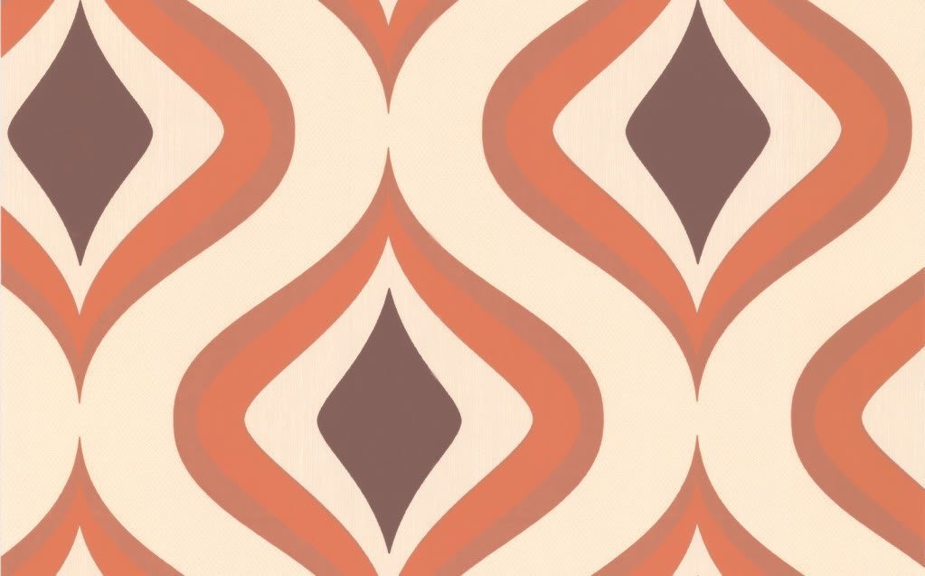
“Jewels”

Oversized Letter Decor: Let’s Start at the Very Beginning…

… a very good place to start!

Art that features initials is so versatile. It looks great as part of a wall display, on a shelf, or on a door. It could make a great gift for a baby or child – it makes a kids – and the parents – feel so special to see their name on things!

There are lots of great ideas for projects featuring artistic initials, and I want to try them all! I decided to start with a simple 3-dimensional cut-out initial wrapped in paper or fabric. Here’s how I did it!

1) Buy or make a base letter: I’ve seen oversize wooden and cardboard letters at craft stores, so you could definitely start with one of those. In this case, I was feeling lazy and cheap – not to mention I do my projects when the kids are either napping or in bed at night, which makes trips to the craft store hard! So, I decided to cut out my own letters from cardboard. I had some extra-thick cardboard leftover from “dish pack” boxes from our move. These are great for lots of cardboard projects, because they are made from a double layer of corrugated cardboard and thus stronger and warp less.

You can find endless fonts by searching on the internet. I settled on Archive Garfield for a classic feel:

Archive Garfield

Archive Garfield upper case letters example from Myfonts.com

My Fonts website

Whole alphabet at Fonts.com

You could print out the letters you want, enlarge and then trace them, but I decided to wing it freehand. First, I decided on the overall dimensions I wanted – nine inches high – and marked that area on the cardboard. Then, I sketched the letters inside the space, using a ruler to make the straight lines. I also made some of the areas a little thicker than they are in the original font, so they would not be too fragile when cut out. I ended up using a popsicle stick to reinforce the thin part of the “K.” Also try to avoid narrow gaps – the inside curve of that “J” turned out to be tricky to wrap around. I used white glue on the very short tabs of paper and held them in place by wedging some bubble wrap in the gap until the glue dried. It turned out fine.

20120415-210502.jpg

Sketch or trace the letters onto cardboard using a ruler to help. Make sure the lines are not too thin and also try to avoid narrow gaps.

2) Apply paper or fabric: This is where you could get creative and use scrapbook paper, wrapping paper, maps, photos, fabric, whatever! I would recommend cutting leaving a one inch margin around your letter – I didn’t have that much, because I was using a scrap leftover from decorating the back of our little guy’s bookcase, which made it harder. Also, if you are using corrugated cardboard, I would just put a couple of spots of glue from a glue stick on the front, because if you glue it down thoroughly, the corrugation will show.

Cut tabs to help ease the paper around curves and corners and then glue down the tabs. Because I had a small margin, I needed to use some tape to help. Once I had the paper wrapped around, I used a popsicle stick with a little white glue on it to help smooth any areas where you could see the tabs, like around the curves.

20120415-212742.jpg

Lightly glue your letter to the back side of your paper or fabric. Cut out with a one inch margin (more than I had!) and cut tabs for the corners and curves. Glue!

3) Voila! and Finish! You could clear coat your letter with clear spray paint or Modge Podge. I wouldn’t do it with the corrugated, because, again, it would make the corrugation show through. It would be a nice finish for wooden letters, though.

20120415-220836.jpg

Finished product! A 3-D initial wrapped in beautiful paper.

4) Hang and enjoy! I’m using 3M Command Picture Hanging StripsEdit. These are very easy to use and have the additional benefit of adding more dimension to the letter, so it really stands out from the wall.

20120415-220903.jpg

3M Command (TM) Picture Hanging Strip – easy and removable!

This initial is for our youngest’s room as part of the wall collection below. The “quilt block” is actually made of paper and was a gift from my friend Penny many years ago. And the vintage nursery switch plate covers go beautifully here, too. The one on the left is mine from when I was little. The other one was picked up at a garage sale for $1. They can also be found on eBay for about $15-25. I didn’t really have a functional use for them, but I think they work perfectly in this display. This whole wall relates back to the other side of his room, where the same paper is lining the bookcase, and a vintage lamp from my childhood provides a reading and night light.

Nursery wall

The “J” in its place on the nursery wall.

And now, here’s a sneak peek at the other kids’ initials! I let them pick their own paper. I was thinking stripes, but I love how the stars turned out.

DIY paper-wrapped wall initials by Jewels at Home

DIY paper-wrapped wall initials for my boys’ rooms!

“Jewels”

Lining Bookshelves: Decorating Inside the Box

I’m always amazed at how easy it is to beautify a bookcase by decorating the back. There are lots of great examples out there of using paint, wallpaper, wrapping paper, or fabric.

In my most recent project, I wanted to add some color and personality to our baby/ toddler’s room. I was thinking of a solid red background for his shelves, but then I lucked out and stumbled upon this fun graphic paper from nineteenseventythree.com. At four dollars a sheet, I was able to cover the entire back of the bookcase for twenty dollars and have some gorgeous paper leftover for cardmaking or another art project. The company is based in Britain, but I found the paper at a local store, Lavish, in Hayes Valley.

Red wrapping paper on bookcase

Graphic red and white wrapping paper lining a nursery bookcase.

For our first’s nursery, I spray-painted the backs of old white Ikea bookcases with blue, masking off some white “stripes” with painter’s tape, and I loved that effect, too. I was able to take the back piece off to paint, which made it a lot easier. I never took a picture of the furniture specifically, so you will have to make do with a baby pic and the shelf in the background.

Blue and white painted bookcase

Blue and white stripes painted on back of nursery bookcase.

I think the nursery projects were my favorite results, but I’ve also experimented downstairs with our living room and kitchen storage. I went through a die-hard Arts and Crafts phase, when we bought a lot of very heavy wood pieces in that style. I still love these bookcases for their classic look and incredible quality, but I wanted to brighten them up for our current decor. I chose Imperial Trellis wallpaper in Silver by Schumacher for its gorgeous classic pattern and the glow of the silver. It’s pricey, but you need so little for a project like this that I bought a single (well, it comes as double, though you can find it sold as a single with a cutting fee) roll for this project and one wall in our powder room, and I will still have some left over. I have to say that the effect was not as dramatic as I hoped, because they are still very dark and heavy, but I think it’s a move in the right direction, and I couldn’t bear to paint or alter the shelves in any other way.

Imperial trellis wallpaper on bookshelf

Imperial trellis wallpaper in silver. (The bookcase styling needs some more work.)

Finally, I also applied some fabric to the back of some glass-front shelves in our kitchen. I got the idea, because I felt that our white bowls, cups, etc. were just “disappearing” visually in the white cabinets, so I wanted to add some color for a backdrop. It was a quick fix using fabric scraps from another project, but I think it’s an improvement!

Fabric lining kitchen cabinet

Green print fabric lining display cabinet in the kitchen.

Mounting tip: In the past, I have used 3M mounting strips of various kinds for attaching fabric or paper to the back of a bookshelf. With the wrapping paper project, I was eager to get started and didn’t have time to run to the store, so I just used blue painter’s tape, and it worked fine. Since the wallpaper came in small sheets, I also used tape on the back to join the pieces as I applied them. If you are using a heavier material – such as fabric or wallpaper – or a material that you want to preserve, the 3M strips are stronger and photo-safe (not that these are photos, but I assume that means they are not acidic, etc.). I definitely wanted the photo-safe for mounting on our Arts and Crafts style bookcases, for example. However, the blue painter’s tape is an easy and inexpensive tool, if you’re in a hurry and hanging something light and not-too-valuable.

More favorite papers:

Stunning temporary wallpaper for your next DIY project!

Tempaper Self-Adhesive Gio Temporary Wallpaper in Silver

Graham & Brown Trippy Wallpaper in Orange

710UvRChlgL._SL1500_

York Wallcoverings Silhouettes Fretwork Trellis Wallpaper, Mint Green/White

Hope you enjoy making your furniture look outside-the-box by decorating inside it!

“Jewels”

This post is shared at:

Lovely Crafty Home