Whimsical Retro Nursery

Here is the first room tour of Jewels at Home. The tours are my motivation to “finish” (and clean up!) our house, room by room. In reality, our spaces are a constant work in progress, reflecting the dynamic nature of our lives, but it’s a great feeling when a room gets to the point where it’s ready to share. Let me know if you have a room in your house to share on Jewels at Home!

Our house was a fixer-upper when we bought it last year. Besides maintenance problems (clogged sewer pipe!) and cosmetic issues (pink, pink, pink!), the house was built as a sort of grand space that meant a small number of large and formal rooms, when what we wanted as a modern family of five was more separation of spaces for sleeping, working from home, and playing. I’m glad I spent so many hours staring at the real estate brochure with floor plan, because I figured out that we could convert the “dressing room” off the master bedroom into our ensuite bath and create an entrance through a hall closet to turn the old master bath into another bedroom. Adding the bedroom, that we are using as a nursery, has been a huge value for us.

Bedroom before

BEFORE: This space was the dated and pink master bath. By making a new entrance through a hall closet, it became a new bedroom!

I figure the reason that the nursery was the first room in the house to be “finished” is probably because it’s a small room, and, of course, because it’s SO fun to decorate a nursery! A child’s room is a place where your imagination is the limit!

Whether it’s because we are indecisive or enjoy change, we’ve moved a lot, and each of our kids has had a different nursery. I’ve loved putting them together, and while there are elements that have naturally been shared by all of them, each is also unique. Our current nursery has established itself with a whimsical retro feel. I preferred to make our kids’ first rooms pretty neutral – no car or princess themes here. I know from experience that they will develop their specific interests soon, but I chose not to make them a focus in the nursery.

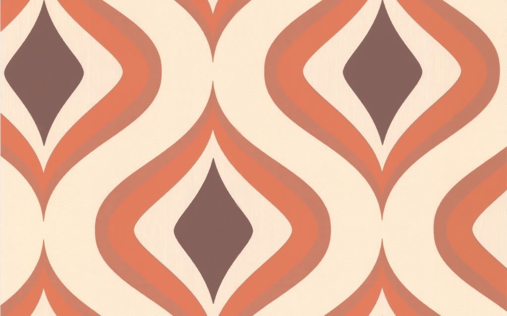
This “Connor” rug from Pottery Barn Kids circa 2003 was the jumping off point for the colors in the room. I love its palette of dark and light blue, sage, and red. Cheerful for a child’s room, but not too juvenile and cutesy.

Connor Rug

"Connor" rug from Pottery Barn Kids has the inspiration colors for the nursery. The red is picked up by the wrapping paper on the inside of the bookshelf, and the blue in the toy bins (which are old diaper boxes wrapped in fabric!). The sage green is in the bedding, including the sleepsack hanging on the wall.

The roman shades from Country Curtains are a find that I cannot recommend highly enough! They are attractive, safe and easy to use (cordless and raise and lower with a spring, like a roller shade), and inexpensive. They’re not custom, and they didn’t have a size that was right for our other rooms, or I would have bought more! Even though they have a “thermal” rather than blackout lining, I find they cut a lot of light for nap time, maybe because of the dark color.

reading chair

Here is our cozy chair for reading, nursing, and snuggling.

I didn’t buy any new furniture for this room when we moved in, because I figured that a nursery arrangement is always temporary anyway. I took a tip from one of my favorite designers, Sarah Richardson, and even though I mixed wood tones, I made sure that each wood tone was found at least twice in the space, so it doesn’t look out-of-place: the crib and dresser have an espresso color, the bookshelf and picture frame on the opposite wall are a light wood, and the floor and chair have a medium tone. I added the wrapping paper to this bookcase in this post on dressing up bookcases: “Decorating Inside the Box.”

bookcase wall

The bookcase has room for display and storage. The mix of dark and light woods can work, as long as you have each wood tone in multiple places in the room.

Change table

This change table is an inexpensive version of the popular modern nursery furniture. I love the wall decal of a branch right next to the window, extending the outdoors into the space. I customized it by adding the letters spelling "sweet dreams."

A lot of the accessories in this room have special meaning. On the shelf and off to the right are a lot of accessories from my childhood, including the lamp, a bronzed shoe, and a “ducky bank”. In our reading corner, I made the quilt, and my close friend knit the baby blanket on the arm of the chair. The display wall between the windows has a paper quilt block from an old friend, a name plaque with motifs from MY baby blanket, vintage switch plates from my baby room, and an oversize letter “J.” You can see how I made the letter here. The jungle animal clothes pegs next to the book shelf is special, because my mom, who did not survive to meet her grandchildren, bought this for them in anticipation many years ago. Last but not least, the squeaky “Jumping Jack” below was a gift she bought for me as a newborn baby with her first paycheck after returning to work. My parents told me, he made me laugh for the first time, and all my kids gave enjoyed him too.

20120423-172040.jpg

My baby toy is bringing smiles to the next generation.

The end result of this transformation is a cozy, comfortable room that brings a smile wherever you look!

“Jewels”

Rummage Sale Finds: The Pleasure of the Hunt

There is hardly a finer feeling than being outside at a flea market or rummage sale on a beautiful day and finding a great deal on something lovely to bring home. Finding used items is not just about saving money – though that’s wonderful, too. It’s also about the personality and dimension that a mix of old and new things can bring to your space.

Today is one of those rare and perfect San Francisco Saturdays, when the sun is bright and hot, and there’s just a gentle spring breeze in the air. We took a family walk out to our neighborhood rummage sale. They call it a “collectibles” sale, but I think that’s a bit generous. The older boys brought their wallets, dreaming of a great Beyblade (if you have no idea what that is, just ask any five- to ten- year old boy!) or Lego find in the toy section, so we all felt the anticipation! We stopped at a fountain along the way, and our oldest shared his pennies, so they could make a wish.

When we arrived at the park for the sale, the boys were in and out quickly, after determining there were no Beyblades to be had. They did indulge in some muffins and lemonade from the bake sale, though. Our oldest later reported that he felt very grown-up, purchasing his own snack and that it was a very satisfying outing for $2.02 (the $.02 having gone into the fountain).

Hubby spotted these vintage board games in the toy section for $1 a piece, and they look ultra cool. They’re dated 1960 and 1958. Here they are on the game table in our den. Can’t wait to try them at a family game night!

vintage board games

Game of the States from 1960 and Gettysburg from 1958 for $1 each! Looking forward to playing these!

Now to my treasures! Nothing big, but I’ve been looking for accessories for our living-dining room, and it was a great place to pick up a few inexpensive items that feel like they have a story behind them.

old wooden box

$5 for this decorated wooden box with a little key.

painted silver box

The metallic spray paint gives a great glow very quickly!

spray paint

I used Krylon grey primer both for priming and a very light dusting over the silver, to give it a more aged look. The silver paint is very shiny!

side table styling

The new-old silver box on the nesting side tables in our living room. Not sure how long this vignette will stay safe from toddler curiosity.

dishes

Total of $11 for these five plates. They will hang on the wall in the dining room.

Today was a ton of fun, but for serious treasure hunting, you cannot beat the Alameda Point Antiques Faire, held the first Sunday of every month. It’s enormous, with row upon row of serious antiques vendors. I went on January 1 this year with a friend, and it was a wonderful start to the year, wandering in the fresh air, enjoying the view of San Francisco, gnoshing on Jamba Juice and kettle corn, and striking bargains! We plan to go back in May, and I’ll be sure to let you know how it goes!

Click the picture for the Alameda Antiques Faire website.

“Jewels”

Jewel-Toned Antiques

I was running errands in the Potrero Hill neighborhood of San Francisco when I came across a unique and stunning boutique called Forgotten Shanghai.

Forgotten Shanghai logo

Amazing and unique store in SF. Click the logo to go to their website.

Their showroom is packed with furniture and decor items that range from Chinese antiques to modern designs with an Asian feel.  There are lots of treasures to browse, and I could have spent hours there, if I didn’t have two kids in tow who were on the verge of becoming the proverbial bulls in the china shop (haha!).

The products that caught my eye the most were the wooden chests and screens that were painted in blue and green jewel tones:

forgotten shanghai boxes

Media and File boxes in gorgeous colors. Click the picture for the product website.

Lacquered wooden screens in a range of fresh colors. Click the picture for the product website.

Tragically, at several hundred dollars a piece, their prices exceeded my budget.  I kept thinking about them, though.  I love adding Asian elements to my home – the classic lines are elegant and complement the Arts and Crafts pieces we have.  And with the fresh blue and green lacquer, these classic forms feel contemporary.  Luckily for me, I had a couple of pieces at home that I could make over to get the same look.

Painted wooden chest

I picked up this solid wood cedar chest off craigslist for $99 a few years ago from a woman who used it for staging homes.  It is stamped inside with “Wills Cabinet Shop Somerset, PA,” which looks like it is sadly no longer around.

chest before

Before: Cedar chest bought off craigslist.

Regular spray paint comes in limited colors.  I had a false start painting with a really unfortunate electric blue from the craft store.  If you don’t find the color you are looking for at the hardware store or regular craft store, I would recommend Montana Spray Paints, which are artists’ paints.  I found this color, Fjordonline, but I later discovered that Aaron Brothers carries Montana paints.  After sanding, priming, and painting, I added several layers of a glossy clear coat.  This really helps give a finished look as well as prevent any color from rubbing off on walls, etc..

painted teal chest

After: chest painted in Montana Fjord with a glossy finish.

Window screen

Another great find was this Chinese wooden window screen that I found at a consignment store for just $65!  Similar screens usually cost several hundred from a knowledgeable seller.  I was torn about painting it, as it always feels a little “wrong” to paint good quality wood.  In the end, I went ahead, thinking that I really needed something to brighten up our living room, which already has a lot of wood on the floors and in the larger furniture pieces.  The paint color is “Swept Away” by Benjamin Moore.  I had it leftover from painting our kids’ bath.  Again, I finished it with several coats of a clear finish to seal it.

Painted screen

Chinese wooden window screen painted in pale blue "Swept Away" by Benjamin Moore.

I’m so happy with how my Forgotten Shanghai copy-cats turned out! I’m especially excited that I make them from things I already had around the house. I have one more screen that is left-over from a carpentry job that I am thinking of painting in a glossy black for the foyer. I’ll post a picture when it’s done!

“Jewels”

Oversized Letter Decor: Let’s Start at the Very Beginning…

… a very good place to start!

Art that features initials is so versatile. It looks great as part of a wall display, on a shelf, or on a door. It could make a great gift for a baby or child – it makes a kids – and the parents – feel so special to see their name on things!

There are lots of great ideas for projects featuring artistic initials, and I want to try them all! I decided to start with a simple 3-dimensional cut-out initial wrapped in paper or fabric. Here’s how I did it!

1) Buy or make a base letter: I’ve seen oversize wooden and cardboard letters at craft stores, so you could definitely start with one of those. In this case, I was feeling lazy and cheap – not to mention I do my projects when the kids are either napping or in bed at night, which makes trips to the craft store hard! So, I decided to cut out my own letters from cardboard. I had some extra-thick cardboard leftover from “dish pack” boxes from our move. These are great for lots of cardboard projects, because they are made from a double layer of corrugated cardboard and thus stronger and warp less.

You can find endless fonts by searching on the internet. I settled on Archive Garfield for a classic feel:

Archive Garfield

Archive Garfield upper case letters example from Myfonts.com

My Fonts website

Whole alphabet at Fonts.com

You could print out the letters you want, enlarge and then trace them, but I decided to wing it freehand. First, I decided on the overall dimensions I wanted – nine inches high – and marked that area on the cardboard. Then, I sketched the letters inside the space, using a ruler to make the straight lines. I also made some of the areas a little thicker than they are in the original font, so they would not be too fragile when cut out. I ended up using a popsicle stick to reinforce the thin part of the “K.” Also try to avoid narrow gaps – the inside curve of that “J” turned out to be tricky to wrap around. I used white glue on the very short tabs of paper and held them in place by wedging some bubble wrap in the gap until the glue dried. It turned out fine.

20120415-210502.jpg

Sketch or trace the letters onto cardboard using a ruler to help. Make sure the lines are not too thin and also try to avoid narrow gaps.

2) Apply paper or fabric: This is where you could get creative and use scrapbook paper, wrapping paper, maps, photos, fabric, whatever! I would recommend cutting leaving a one inch margin around your letter – I didn’t have that much, because I was using a scrap leftover from decorating the back of our little guy’s bookcase, which made it harder. Also, if you are using corrugated cardboard, I would just put a couple of spots of glue from a glue stick on the front, because if you glue it down thoroughly, the corrugation will show.

Cut tabs to help ease the paper around curves and corners and then glue down the tabs. Because I had a small margin, I needed to use some tape to help. Once I had the paper wrapped around, I used a popsicle stick with a little white glue on it to help smooth any areas where you could see the tabs, like around the curves.

20120415-212742.jpg

Lightly glue your letter to the back side of your paper or fabric. Cut out with a one inch margin (more than I had!) and cut tabs for the corners and curves. Glue!

3) Voila! and Finish! You could clear coat your letter with clear spray paint or Modge Podge. I wouldn’t do it with the corrugated, because, again, it would make the corrugation show through. It would be a nice finish for wooden letters, though.

20120415-220836.jpg

Finished product! A 3-D initial wrapped in beautiful paper.

4) Hang and enjoy! I’m using 3M Command Picture Hanging StripsEdit. These are very easy to use and have the additional benefit of adding more dimension to the letter, so it really stands out from the wall.

20120415-220903.jpg

3M Command (TM) Picture Hanging Strip – easy and removable!

This initial is for our youngest’s room as part of the wall collection below. The “quilt block” is actually made of paper and was a gift from my friend Penny many years ago. And the vintage nursery switch plate covers go beautifully here, too. The one on the left is mine from when I was little. The other one was picked up at a garage sale for $1. They can also be found on eBay for about $15-25. I didn’t really have a functional use for them, but I think they work perfectly in this display. This whole wall relates back to the other side of his room, where the same paper is lining the bookcase, and a vintage lamp from my childhood provides a reading and night light.

Nursery wall

The “J” in its place on the nursery wall.

And now, here’s a sneak peek at the other kids’ initials! I let them pick their own paper. I was thinking stripes, but I love how the stars turned out.

DIY paper-wrapped wall initials by Jewels at Home

DIY paper-wrapped wall initials for my boys’ rooms!

“Jewels”

Upholstered Chairs: Beautiful from the Back

I love such a love for beautiful fabrics! And why use just one fabric to upholster a chair, when you can use two?! The back of a chair is a great place to use a more delicate, expensive, or ornate fabric that might not be ideal for the seat, and the contrast between the two materials adds a lot of interest. I’ve seen great examples of this from some of my favorite designers:

Candice Olsen dining chairs

Candice Olsen used a contrasting fabric on the outside of these beautiful dining chairs. The blue ties the seat and outside together.

Candice Olsen Design

Sarah Richardson chairs

Sarah Richardson strikes a great playful note with these chairs upholstered in multiple fabrics. Again, the color theme - in this case, red - tie them together.

Sarah Richardson Design

So, I was looking around my house for a way to try this, when my eyes landed on a pair of green side chairs that we’ve had for many years as extra seating in our living room. They were originally dining chairs that worked well for saving space, and I cut down the legs to make them more comfy for lounging. Our new house can get dark, so I’ve been trying to lighten up our furniture, and I just happened to have recently bought this gorgeous floral fabric. I didn’t even have a specific plan for it, but I knew that I had to have it (did I mention, I have a weakness for beautiful fabrics?!) I spotted it on Fabricguru.com, which is my favorite online fabric store. They have great prices on remnants and an easy-to-browse interface. The downside is that a lot of the fabrics are discontinued or almost so, so if you need more down the road, it may be hard to find.

Floral Noir

Robert Allen Waldemere Contemporary Floral Printed Cotton Drapery Fabric in Noir

Here’s what happened when the old chairs met my new fabric:

floral fabric on green chairs

Waldemere floral fabric on the outside of green velvet chairs.

To apply the fabric, I experimented with our staple gun, but in the end, it worked best to apply the fabric with just a regular craft glue gun. I folded about a half inch “seam” around the edge and just glued it on. I was prepared to cover the edges – or staples, had I used them – with some piping, but I lucked out, and the panels had piping already, so it looked very finished with very few steps. I think you could retrofit a variety of existing chairs with some creativity and minimal upholstery skills.

For some more inspiration, check out these beautiful examples found by other bloggers:

Saks chair

Spotted by Caitlin Wilson at Saks.

Caitlin Wilson Design

K-desgn chairs

Chairs by K-design, spotted by Decorati.

Decorati Interior Design Blog

Go give it a try! It might take some adaptation to work on your particular chairs, but keep in mind using nailhead trim, piping, or decorative braid to hide staples and seams, creating a transition as you turn your chairs into eye-pleasing conversation pieces!

“Jewels”

This project is shared at:
handmade projects

Lining Bookshelves: Decorating Inside the Box

I’m always amazed at how easy it is to beautify a bookcase by decorating the back. There are lots of great examples out there of using paint, wallpaper, wrapping paper, or fabric.

In my most recent project, I wanted to add some color and personality to our baby/ toddler’s room. I was thinking of a solid red background for his shelves, but then I lucked out and stumbled upon this fun graphic paper from nineteenseventythree.com. At four dollars a sheet, I was able to cover the entire back of the bookcase for twenty dollars and have some gorgeous paper leftover for cardmaking or another art project. The company is based in Britain, but I found the paper at a local store, Lavish, in Hayes Valley.

Red wrapping paper on bookcase

Graphic red and white wrapping paper lining a nursery bookcase.

For our first’s nursery, I spray-painted the backs of old white Ikea bookcases with blue, masking off some white “stripes” with painter’s tape, and I loved that effect, too. I was able to take the back piece off to paint, which made it a lot easier. I never took a picture of the furniture specifically, so you will have to make do with a baby pic and the shelf in the background.

Blue and white painted bookcase

Blue and white stripes painted on back of nursery bookcase.

I think the nursery projects were my favorite results, but I’ve also experimented downstairs with our living room and kitchen storage. I went through a die-hard Arts and Crafts phase, when we bought a lot of very heavy wood pieces in that style. I still love these bookcases for their classic look and incredible quality, but I wanted to brighten them up for our current decor. I chose Imperial Trellis wallpaper in Silver by Schumacher for its gorgeous classic pattern and the glow of the silver. It’s pricey, but you need so little for a project like this that I bought a single (well, it comes as double, though you can find it sold as a single with a cutting fee) roll for this project and one wall in our powder room, and I will still have some left over. I have to say that the effect was not as dramatic as I hoped, because they are still very dark and heavy, but I think it’s a move in the right direction, and I couldn’t bear to paint or alter the shelves in any other way.

Imperial trellis wallpaper on bookshelf

Imperial trellis wallpaper in silver. (The bookcase styling needs some more work.)

Finally, I also applied some fabric to the back of some glass-front shelves in our kitchen. I got the idea, because I felt that our white bowls, cups, etc. were just “disappearing” visually in the white cabinets, so I wanted to add some color for a backdrop. It was a quick fix using fabric scraps from another project, but I think it’s an improvement!

Fabric lining kitchen cabinet

Green print fabric lining display cabinet in the kitchen.

Mounting tip: In the past, I have used 3M mounting strips of various kinds for attaching fabric or paper to the back of a bookshelf. With the wrapping paper project, I was eager to get started and didn’t have time to run to the store, so I just used blue painter’s tape, and it worked fine. Since the wallpaper came in small sheets, I also used tape on the back to join the pieces as I applied them. If you are using a heavier material – such as fabric or wallpaper – or a material that you want to preserve, the 3M strips are stronger and photo-safe (not that these are photos, but I assume that means they are not acidic, etc.). I definitely wanted the photo-safe for mounting on our Arts and Crafts style bookcases, for example. However, the blue painter’s tape is an easy and inexpensive tool, if you’re in a hurry and hanging something light and not-too-valuable.

More favorite papers:

Stunning temporary wallpaper for your next DIY project!

Tempaper Self-Adhesive Gio Temporary Wallpaper in Silver

Graham & Brown Trippy Wallpaper in Orange

710UvRChlgL._SL1500_

York Wallcoverings Silhouettes Fretwork Trellis Wallpaper, Mint Green/White

Hope you enjoy making your furniture look outside-the-box by decorating inside it!

“Jewels”

This post is shared at:

Lovely Crafty Home