Beach-inspired Kids’ Bath

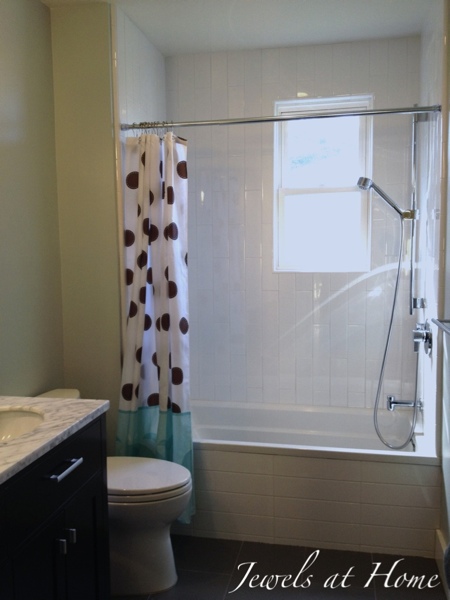
The kids/guest bath was a part of our big renovation when we moved into the house. It was originally a Jack-and-Jill (aka Brady Bunch) bathroom with no tub, and like much of the house, it was pink!  We wanted to turn it into a hall bath, which would be much more practical, especially because we were adding a new bedroom – the nursery – upstairs.  The reconfigured area also allowed us to move the laundry up from the basement, which is vastly more convenient.

It’s a simple space with a feel that’s the perfect blend of classic and contemporary. Since its also a guest bath, and these little boys are fast becoming little men, I didn’t want to make the decor too cutesy.  My original idea was to have a “Three Men in a Tub” theme, with a gallery of bath photos. Wet babies are so adorable, so why not a gallery wall in the bathroom? I still love that idea, but with our recent vacation in Hawaii, I hit on a beach theme instead.

Hawaiian beach-inspired bathroom.  Shared kids and guest bathroom.  {Jewels at Home}

As for function, there’s a lot of practicality in this small space.

When the architect first proposed the double vanity for a kids bath, I wasn’t sure it was necessary, but hubby, who comes from a family of four kids, assured me it would be put to good use, and he was right!

20130324-163234.jpgHawaiian beach-inspired bathroom.  Shared kids and guest bathroom.  {Jewels at Home}

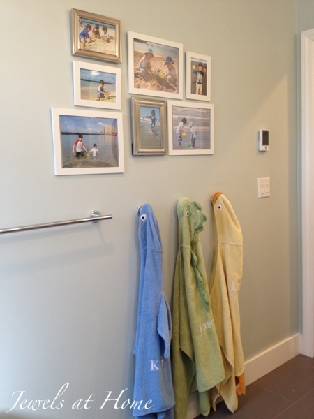
My kids never seem to successfully get their towels back on a towel bar, so I opted for these robe hooks. The adorable monogrammed hooded towels from Pottery Barn Kids were a gift from a dear friend when our youngest was born, and they fit perfectly here.

Hawaiian beach-inspired bathroom.  Shared kids and guest bathroom.  {Jewels at Home}

The Hawaiian “honu” sea turtles were ceramic coasters I found at a crafts fair in Honolulu, and our little family adds some color and whimsy to this wall.

Hawaiian beach-inspired bathroom.  Shared kids and guest bathroom.  {Jewels at Home}

And finally, some pictures of life by the water, to transport us every day.  Every time JJ sees this wall, he yells, “Beach!”

Hawaiian beach-inspired bathroom.  Shared kids and guest bathroom.  {Jewels at Home}

A few more pictures:

Hawaiian beach-inspired bathroom.  Shared kids and guest bathroom.  {Jewels at Home}20130324-163217.jpg

Hawaiian beach-inspired bathroom.  Shared kids and guest bathroom.  {Jewels at Home}


Hawaiian beach-inspired bathroom.  Shared kids and guest bathroom.  {Jewels at Home}

Hawaiian beach-inspired bathroom.  Shared kids and guest bathroom.  {Jewels at Home}

Let’s make a splash!

“Jewels”

Living Room Tour

After some peeks into the small spaces in our house – the powder room, the nursery, the laundry, the master bath – I’m glad I can show you our living room. It’s actually only one half of the original living room – we are using the other half of this enormous room as our dining room, and we turned the separate dining room into a family room.

I am not sure quite how to describe the style – it’s a little bit contemporary but classic. It has Chinese elements, but more of a Regency Chinoiserie feel than traditional Chinese. Is this the Asian fusion of the decorating world? Anyway, I love the cool soothing blues and grays warmed up with some green. It satisfies my desire for a grown-up space but is still a very comfortable spot to hang out.

Not much more explanation needed, so I’ll get to the pictures.  I’ve included links to the many DIY projects in this room.

Living room tour. Classic contemporary space with Asian elements.  {Jewels at Home}

A view of the living room side of our living-dining room, from the foyer.

Living room tour. Classic contemporary space with Asian elements.  {Jewels at Home}

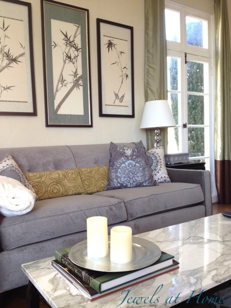
The bamboo brush paintings are by my mom.  I sewed the living room pillows and repainted the vintage marble-top coffee table.

Living room tour. Classic contemporary space with Asian elements.  {Jewels at Home}

Living room tour. Classic contemporary space with Asian elements.  {Jewels at Home}

This picture was from the Holiday House Tour:

Living room tour. Classic contemporary space with Asian elements.  {Jewels at Home}

I love this elegant old Chinese chair that I picked up at the flea market.  It’s sitting by the window, next to a craigslist-find chest that I painted in teal.

Living room tour. Classic contemporary space with Asian elements.  {Jewels at Home}

Here’s another sunny view of our living room.  I love that it has so many windows.

Living room tour. Classic contemporary space with Asian elements.  {Jewels at Home}

Living room tour. Classic contemporary space with Asian elements.  {Jewels at Home}

Living room tour. Classic contemporary space with Asian elements.  {Jewels at Home}

Living room tour. Classic contemporary space with Asian elements.  {Jewels at Home}

To the left of the piano is an antique wooden window screen that I painted, and on top is a repurposed shoe box, decorated with paper.

Living room tour. Classic contemporary space with Asian elements.  {Jewels at Home}

These nesting tables are from a consignment store, and the silver box is a rummage sale find that I painted in silver.

Living room tour.  Classic contemporary space with Asian elements.  {Jewels at Home}

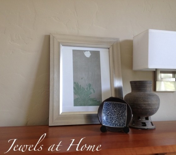
This vignette on top of a bookshelf includes some art from a favorite calendar, an antique Korean vase given to us by Steve’s parents, and a little Japanese dish I picked up years ago while shopping with my mom and sister.

Living room tour. Classic contemporary space with Asian elements.  {Jewels at Home}

The bookshelf on the other side of the window has a similarly sentimental display – art from a calendar and from an old friend, a small blue and white Chinese vase from my grandmother’s house, and some candle sticks I found in thrift store.

Living room tour. Classic contemporary space with Asian elements.  {Jewels at Home}

Thanks for visiting!

“Jewels”

New Entry – First Impressions Count!

When we bought our house last summer, the style did not suit us at all. I give a lot of credit to hubby for seeing past the pink and frills to appreciate that this could be our home.  Now we’re updating this place bit by bit, and I’m happy to say that it feels like home! We started inside with a renovation upstairs that gave us our new master bath, laundry area, and nursery. More about the upstairs, when I finally get the rest of it cleaned up. We decided to put off a downstairs renovation, due to cost and convenience, but I did spruce up our powder room with some wallpaper and a new chair rail and vanity.

Once our upstairs bedrooms were comfortable, the next priority was painting the exterior, where the paint on the trim was peeling, and equally importantly, the house was pink!

BEFORE:

BEFORE: Pink and stuffy entry did not reflect our personality.

BEFORE: Pink and stuffy entry did not reflect our personality.  The house number sign was white plastic!

Hooray for

  • new paint
  • a new house number sign (the old one was white plastic)
  • our whimsical doggy statue
  • and some old pots and flowers

Now, our entry is casual and pretty, which is much more our style.  The dog our light-hearted take on more serious front door statuary.  I found him in a flower shop in Toronto more than a decade ago, and he reminded me of our dog, Cooper, so I gave him to Steve for his birthday one year.  Now that Cooper is no longer with us, it’s sweet to have him as our guardian angel.

I tried to hang up the house number sign, but the stucco was defeating my masonry bit and my adhesive, so I just propped it up, and I actually like it there!  There’s lots more gardening that could be done to improve our curb appeal and functionality, but for now these little touches make it feel like home when you walk up to the door.

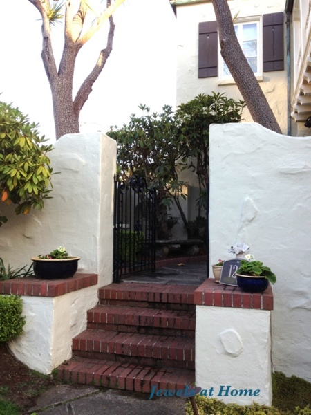
A new house color and some flowers at the front door make this place feel like home.

A new house color and some flowers at the front door make this place feel like home.

A new house color and some flowers at the front door make this place feel like home.

20120730-230807.jpgA new house color and some flowers at the front door make this place feel like home.

I usually putter around inside the house, so I can thank this little helper for bringing me outside. He had a lot of fun digging, and I had to work hard to channel his energies into the right areas!

Welcome Home!

“Jewels”

Ensuite with a View

As I mentioned in the room tour of our nursery, we did a major renovation after we bought our house last year. As part of that, we converted the “dressing room” off the master bedroom into our ensuite bath and created a new bedroom where the old master bath was. The new master bath has some of the best views in the house, making it a lovely place to start and end the day.  Links to the DIY projects in this room are at the bottom of this post.

Before:

Old dressing room

Before: This dressing room was pretty but not a good use of space.

As the former dressing room, this is not a big space. Still, we managed to fit in our whole wish list: soaking tub, separate shower, double vanity with medicine cabinets and lots of storage. (We just moved from a house that was built with a stand-alone sink and no vanity or medicine cabinet in every bathroom! A cool look in concept, but ultimately, it meant that we had clutter and extra storage crammed into the spaces.

The tour:

I do love the white or espresso vanities that are so popular, but I wanted to do something a little different, so we chose this warm natural oak with simple shaker doors. A secret: the vanity is actually made from Ikea kitchen cabinets!

Master bath by Jewels at Home

Large shower and double vanity fit into this small space.

Master bath by Jewels at Home

Double vanity with Ikea cabinets as base. Mirrored medicine cabinets from Restoration Hardware.

Master bath by Jewels at Home

Another view of the double vanity made with Ikea cabinets and mirrored medicine cabinets from Restoration Hardware.

Master bath by Jewels at Home

Toilet area and new master bath with tub under the window.

Master bath by Jewels at Home

Deep tub under the window.

With a View…

View from master bath

View from master bath

Sunset view

Sunset view from master bath.

It’s great to have this little spot of peace in our hectic house all finished now.

The DIY projects in this room are:

Hope you are feeling inspired!

“Jewels”

Perfectly-Mixed Traditional Dining Rooms

I recently put together a contemporary mixed dining space for my dad’s house, but there are many examples of beautifully eclectic traditional spaces as well.  As I mentioned in the previous post, the key is to balance contrast and connection between the diverse elements in a room.

Here are two examples from two of my favorite designers: Sarah Richardson and Candice Olson, as well as some pictures of our dining room at home.

Sarah’s House

This beautiful dining space has a modern take on many traditional elements, such as the wallpaper and Queen Anne chairs (remember when I repainted my Queen Anne chairs?).

Contrast:

  • The plush dining bench sits opposite – literally – to the wooden Queen Anne chairs
  • The trestle table has a simple, rustic style and dark color that give a strong foundation and sense of comfort to this light, glittery room.

Connection:

  • The grey color of the chairs reflects the overall light neutral palette of the room.
  • Both the bench and the chairs have an ornate, traditional feel, as does the chandelier.
Sarah's House Dining Room by Sarah Richardson

Sarah’s House Dining Room by Sarah Richardson

Go to Sarah Richardson Design

Divine Design:

Candice Olson has a great eye for beautiful things.  Her rooms always feel lush and complete to me.  This dining room design looks fairly simple, but there is so much beauty in the details.

Contrast:

  • The white and black palette provides instant contrast.
  • Candice used two different chairs at the table, with more substantial arm chairs at the head of the table.

Connection:

  • The black and white color scheme is carried through every part of this room, including the chairs, rug and curtains.
  • Even though the head and side chairs are different, they have a similar scale and shape to them, so they work together.
Candice Olson dining room featured in Elle Decor

Candice Olson dining room featured in Elle Decor

Go to Candice Olson’s website

Jewels’ house:

I also have a mixed dining set at our house, where I painted and reupholstered our Ikea chairs to work with a dining table from craigslist that I had fallen in love with.  I started out looking for cherry wood Arts and Crafts chairs, and I am so glad that I ended up painting our chairs black.

Contrast:

  • Black and cherry wood look beautiful together, without disappearing into each other or feeling heavy and overwhelming, as a more traditional wooden set can.
  • I have two traditional Chinese chairs at the head of the table, which is a perfect place to introduce something different.

Connection:

  • The chairs all tie together, because of their dark color and similar lines of the chair backs.
  • The Ikea chairs have a geometric cutout design detail on the back that is similar to the cutout design on the base of the cherry Arts and Crafts table.
Dining Room with painted and reupholstered chairs by Jewels at Home

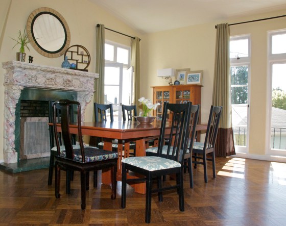
Dining Room with new chairs. The head chairs are Chinese antiques, while the side chairs are transformed Ikea chairs. They all work together, because they share color and/or other design elements.

Dining Room with painted and reupholstered chairs by Jewels at Home

Dining room from the other side.

When you are looking for home decorating ideas, you can easily work with what you have by switching pieces of a dining set, slipcovering your chairs, or painting them for a fresh look.  Once again, I hope you feel inspired to create your own unique combination of elements in your dining space.  It can feel intimidating, but creating connections with shape, material, and color will help bring all the things you love together.

“Jewels”

Perfectly-Mixed (not Matched!) Contemporary Dining Spaces

A matched dining set is just fine. But sometimes, your chairs wear out, you come across the perfect table at a thrift store, you move house and your old things don’t fit… or you just want to create a fresh and creative look in your dining area. If you’re feeling inspired, look at these examples of mixed chairs and tables to see how you can create a space that is unique and beautiful!

You can make a big statement by using a furniture piece of a completely different style from the rest of the room, but usually, it works best to balance contrast and connection. That is, the contrast of different materials, colors, and forms creates visual interest, but connections, or common elements between pieces in the room will pull the look together.

Here are some examples that blend modern style with a comfortable, homey look. I look at more traditional spaces in a companion post.

Hanna’s Room

This is a fresh and airy dining area from Hanna’s Room.

Contrast:

  • The natural wood of the table stands out in a space that is otherwise all white.
  • Its simple straight lines form a backdrop for the curvy chairs.
  • The bare bulb pendants and modern white chairs feel crisp against the other soft, worn surfaces in the room.

Connection:

  • White is the obvious theme in this room, found in the walls, floor, curtains, chairs, and other accessories.
  • The wood table is simple enough that it doesn’t overpower the rest of the room, and the material ties into the wooden floor planks.
rustic table with modern chairs

This wooden table works perfectly in a clean white space by providing a contrasting material and color. Its clean lines fit with the modern design, and the wood relates back the painted wood floor. From Hanna’s Room blog.

Go to Hanna’s Room

Quiest-Brooke

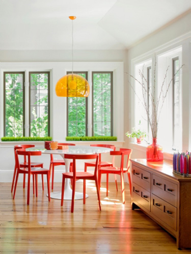
Here’s another example of a mixed dining set using mid-century modern elements. The photo is from Quiest-Brooke

Contrast:

  • The warm red of the chairs contrasts against the distinctive white tulip table.
  • Both the red and white provide interest against the wooden floor and wooden sideboard.

Connection:

  • All the furnishings in this room have a mid-century style.
  • The round back and mid-century style of the chairs works perfectly with the tulip table and warms it up considerably from the cool space-age look of a complete tulip dining set.
  • The red color is echoed in the pot and vase, and the white blends with the white walls and ceiling.
tulip table with red chairs

This distinctive white tulip table was paired with red wooden chairs. The circular back of the chairs and the mid-century aesthetic tie them together. The chairs are a beautiful accent in this room. From Quiest-Brooke.

Go to Quiest-Brooke

Dad’s beach house:

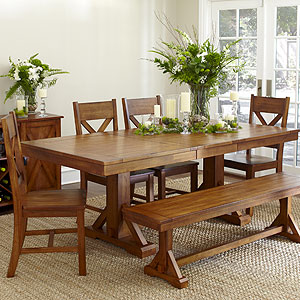
The two rooms above were part of my inspiration in creating the dining space in my dad’s beach house. This home is built with modern straight lines, but with an emphasis on natural materials, like the mahogany trim. As a coastal vacation home, it should be warm and inviting, too. There are many wonderful sources for rustic wooden tables – flea markets, Craigslist, thrift stores, or furniture manufacturers that make tables from reclaimed wood. I ended up buying a new table that still has that aged look. It’s the Antique Honey Verona table from Cost Plus World Market. I like the trestle style for its looks and for easy of seating (no bumping up against the legs of the table!). You can see in the picture below that Cost Plus paired chairs with a bench, which is another great way to add interest to your dining set. It’s still a lot of wood in the same color, though, and the look is too heavy and rustic for our space.

Cost Plus World Market Verona dining set

Cost Plus World Market Verona dining set

I chose to pair this rustic table with Jake chairs from Room and Board. These are very similar to the ones in picture from Hanna’s Room. I’ve seen the same style for literally ten times as much money from other sources, but I couldn’t tell you why. I was inspired to add some color after seeing the red chairs in the picture from Quiest-Brooke, so I got the Jake chairs in coastal-inspired white and blue, with two orange chairs for a fun accent at the head of the table. I still haven’t decided of three different chai colors is too much, so I took some pictures with and without the blue chairs. I could spray those white. What do you think?

Jake Chair from Room and Board

Jake Chair from Room and Board

Here is the dining space in my dad’s beach house. I feel like it succeeded in blending modern features with a comfortable, coastal style. The chandelier is from West Elm. I don’t think the room needs anything more, though I might find or make a piece of art for the wall.

Contrast:

  • The antiqued wooden table adds a rustic touch to the new and modern space.
  • the orange chairs at the head of the table add interest next to the white chairs.
  • The modern lacquered chairs contrast with natural materials in the table, chandelier, and window trim.

Connection:

  • The wood table echoes the wood in the trim.
  • The chairs are all the same style, although they have different colors, and those colors are found in other parts of the room as well.
  • The chairs, table, and chandelier all refer to the ocean in the material, color, or form.

Eclectic coastal dining room by Jewels at Home

Eclectic coastal dining room by Jewels at Home

20120529-152145.jpgEclectic coastal dining room by Jewels at Home

Jewels’ house:

Although the style is completely different, I also have a mixed dining set at our house, where I painted and reupholstered our Ikea chairs. I talk about examples from that room and other more traditional spaces in the companion post: Perfectly-Mixed Traditional Dining Rooms.

I hope you feel inspired and emboldened to create your own unique and exciting mixed dining set. As long as some elements – shape, material, color – tie into your space, you’ll end up with a look that’s striking and cohesive.

“Jewels”

Powder Room Reveal – Tiny Silver Gem

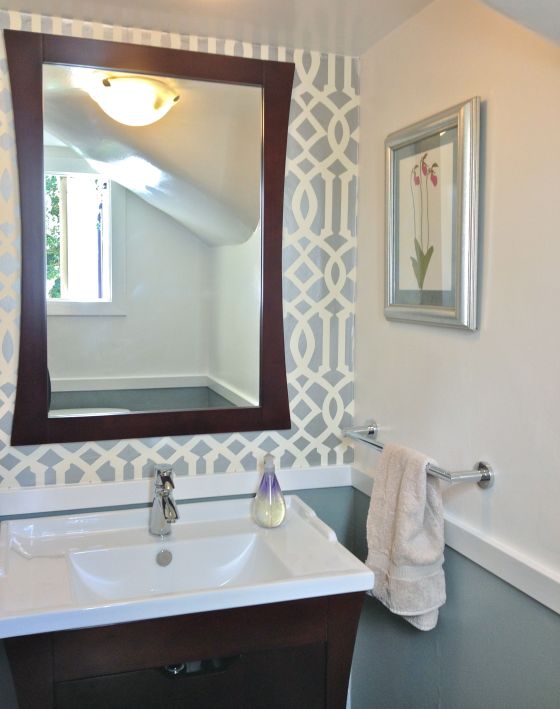
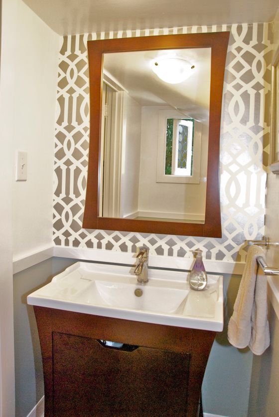
I am so pleased to finally show you our new powder room! It took longer than I anticipated, but it turned out just as I hoped. I used lots of silver in this small space, to make it feel brighter.

Powder Room by Jewels at Home 1

The finished powder room has lots of bright and elegant details, like the Imperial Trellis wallpaper and new chair rail.

We did not want the hassle or the expense of a full renovation, so I did not take out the walls or floor, even though they were far from perfect.  I worked with what we had and

I’m very happy with the result. Before, the room felt unfinished (because, as hubby points out, it was unfinished) and plain. I  would actually avoid it and go upstairs to a “real” bathroom. Now, it’s still small, but it feels polished and pretty, and I occasionally peek in just to take a look (okay, that won’t go on for long, I hope).

Vanity area before

BEFORE: The whole room was very white – blah – with dated gold-tone fixtures.

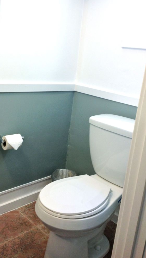
I got the help of a handyman to change out the old pedestal sink for this new vanity.  Our half bath is very small, so I looked for a long time to find a small vanity that didn’t feel undersized.  I am happy with the look and functionality of this Covus vanity found on Overstock.  The new towel bar and toilet paper holder add a shiny touch in polished chrome.  The art is a print from an Henry Evans calendar (more of those to see in upcoming posts, too).  I picked the color of the flower and picture mat to tie in the old floor colors.  The frame was a thrift store find and brings more silver into the room.

Here are some more views of the finished room:


Powder Room by Jewels at Home

Powder Room by Jewels at Home 3

Powder Room by Jewels at Home

I’m very relieved to have this powder room off the to-do list.  It was getting embarrassing!  Now, I can get on to some more fun projects that I’ll post soon.

“Jewels”

Ikea Dining Chairs All Grown Up – Craftsman and Regency Makeovers

No doubt it’s lovely to buy something new for your house, but it can also be fun when furniture you have had for a long time takes on new forms and uses.

Hubby and I first bought these chairs from Ikea thirteen years ago when we were living on the other side of the continent. There were four of them in birch with white seats around a small matching kitchen table in our apartment. Over the years, we accumulated more from Ikea and then through Craigslist, when Ikea stopped making them. Our collection of twelve chairs has moved across the country and through several houses with us. They’ve held up wonderfully as our everyday dining chairs for thirteen years!

I can’t dig up a good picture of the way the set originally looked, but I’ll keep an eye out for it. Meanwhile, I found this old stock photo on the internet.

original ikea chair

This is the original chair we bought from Ikea in birch, tough ours had white seats. I can’t remember its cute Swedish name, but I think it started with “A.”

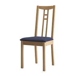
Ikea borje chair

Ikea Borje chair.  A current model that has a somewhat similar look.

The cute birch table with a glass top met an untimely end (long story), and we replaced it with an Arts and Crafts/ Craftsman/ Mission style cherry wood table. At that time, I put slipcovers in the chairs, since they didn’t match.

Arts and Crafts Makeover:

Three or four years ago, I was shopping for chairs to go with the Arts and Crafts style dining table, when I realized the solution was right beneath my nose! I still liked the elegant geometric lines of the Ikea chairs, which I think are reminiscent of Frank Lloyd Wright, perhaps the most well known architect of the Arts and Crafts movement. It was just the light color of the wood that didn’t work. Staining the chairs would have involved stripping the finish and trying to match the color. Even if i had been able to do that perfectly – and that is not likely – the grain of the woods would still not have matched.

In any case, it really isn’t necessary to have chairs that match your table – nor nightstands that match your bed. It actually looks so much more interesting to mix and match. The chairs at the head of our dining table are not the same as the side chairs, either, and I feel it all works together.

So, our chairs that started as Scandinavian modern evolved to Arts and Crafts with new black paint (tips on painting in an earlier post) and tan microfiber suede seats. Microfiber suede, also called faux suede or ultrasuede, has a nice soft texture but is extremely durable and washable – I have scrubbed these seats with a soapy kitchen sponge on more than one occasion, and they end up looking as good as new. There are microsuedes intended specifically for upholstery that have a backing to give this soft material a lot more structure. If you can find this, it’s highly recommended! Four of the chairs with the tan seats are at our games table, which is our original cherry dining table, in the family room.

ikea to arts and crafts

The first makeover: I adapted our modern Scandinavian chairs to go with an Arts and Crafts style table by painting then black and adding tan faux suede seat fabric.

games table

A round games table in the family room is perfect for art projects and board games with the kids. The tan microfiber seats hold up very well!

Regency Makeover:

We move way too often, but I do like the opportunity to change the design of our rooms. We still have some great Arts and Crafts furniture, but I wanted to brighten up our home and incorporate more contemporary and Asian elements. It’s still a work in progress, but I’m trying to develop a bit of a Hollywood Regency/ Chinoiserie feel in our new living-dining room, and I love that these familiar old chairs have been able to come along for the ride.

So, in our current home, I’ve changed the seats on the majority of the chairs to a whimsical Chinoiserie print in blue and cream: Robert Allen Lake Paradise in spa, an outdoor fabric that’s durable and wipeable. These are chairs that are used daily – including by the kids – and I just didn’t think that ordinary fabric would hold up. The polyester is not as soft as a nice upholstery cotton, but our bottoms haven’t minded. I showed how to upholster the seats in earlier post. Start looking around, and you’ll find that outdoor fabrics now come in almost any color, pattern, or texture. Many great fabric designers have beautiful prints meant to stand up to the outdoors, often including some of the same patterns they have in their indoor collections and more!

ikea to regency chair

Another step in the evolution of our old Ikea chairs. This new fabric gives them an elegant yet whimsical feel that fits in with the Chinoiserie/ Regency look I am working on in our living-dining room.

Dining Room with painted and reupholstered chairs by Jewels at Home

Dining Room with new chairs. The space is still a work in progress.

Dining Room with painted and reupholstered chairs by Jewels at Home

Dining room from the other side. I’m happy with the wallpaper inside the shelves.

The dining room is starting to come together. I do like how the Imperial Trellis silver wallpaper looks inside the bookcase. Now that I look at the collection of plates again, I think I could use a couple more. I also want to make over or replace the sideboard. My fantasy is to find an old Thomasville or Henry Link Bali Hai dresser with faux bamboo accents to repaint for that area. And most of all, I would love to change the fireplace mantel. It is plaster with a cheesy faux marble finish, and there are two disembodied heads that stare out at you! Part of me wants to take the whole thing out, but since it’s historical, I might keep it and try to remove the heads and repaint it. I’d also like to do a few small projects like recover or replace the cushions on the head chairs, sew a runner for the sideboard, work on accessories, etc.. Well, one thing at a time. I’m having fun every step of the way!

“Jewels”

Laundry Area Organization: Loads of Charm

When we moved into our house, we renovated the upstairs, and one of our goals was to bring the laundry up from the basement. With the kids, we do so much laundry that I knew this would be a huge improvement for us: no lugging baskets up and down the stairs, no descending into the damp basement daily.

And, indeed, we love having the laundry  close to our bedrooms – well, as much as one can use the word “love” in association with dirty clothes and folding. The laundry area moved to a small hallway next to the kids’ bathroom, which makes it easy for them to drop their things in the hamper when changing. The new location also means that we can quickly start loads, without going out of our way, and we can sort and fold in the comfort of a bedroom.

Of course, there are limitations to the new laundry arrangement, too. Because the area was added on, rather than part of the original house design, it’s small: just enough room for a stacked washer and dryer and a few shelves. And because it’s in the hallway, the laundry area is constantly visible – no shutting the doors to hide clutter!

On the bright side, decorating a small space is a doable project! Here’s our laundry area “before.” Not much to work with but also a manageable task that won’t drag on like our powder room.

laundry area before

BEFORE: top of laundry area

laundry area before - bottom

BEFORE: bottom of laundry area

Most of the examples of laundry room designs feature full rooms, and it was hard to apply those ideas to our little space. When I saw this laundry closet makeover by Amy at eat.sleep.decorate., I felt like it was just the inspiration I needed! I love the pretty storage baskets – all tied together by the cheerful green color scheme, but varied to give visual interest and a homey feel. I don’t always like designs to be symmetrical, but I think it works here, where there are so many things in a small space. The labels are adorable and functional too – even in a small space, where you basically know where things are, labels really help in both finding things quickly and in keeping things organized – you (and your family members – nah, who am I kidding?) are more likely to return things to their proper place, when it’s clearly labelled. Finally, I agree with her that a touch of art on the wall really makes this laundry area feel like a part of the home, rather than just a utilitarian necessity.

Amy's laundry closet

My inspiration: Amy at eat.sleep.decorate. created this fresh and organized laundry area. Click the picture to see her entire post with lots of great tips.

Go to eat.sleep.decorate.

I started by taking inventory and sorting what we had in the area:

  • Hampers for dirty clothes – I like to have separate ones for colors and whites, which makes starting loads easier, though we occasionally get things reshuffled by our toddler!
  • Baskets for clean clothes – I have one labeled for each child and a few extras.
  • Detergent, stain remover
  • Bags – mesh ones for delicates and wet-bags for cloth diapers.
  • Container for coins and other pocket treasures.
  • Other – garment drying racks, towels, cleaning supplies, etc..

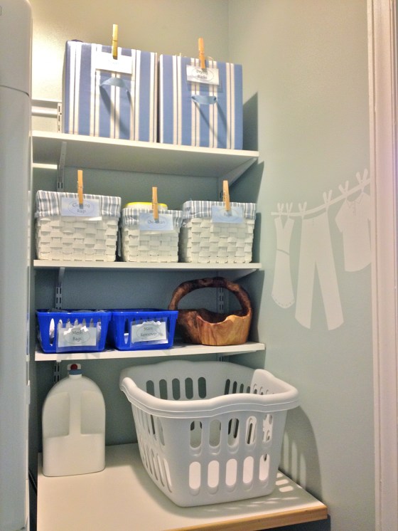
Then I collected a variety of storage baskets to fit with the blue and white color scheme. Like the symmetry, a very simple color scheme works here, because it makes the area look less “busy.” I made some fabric-covered boxes for the top shelf (more on making those boxes in another post!) and the rest were items we had around the house. I love using the “root” basket for collecting coins and other odd items from pockets. It has a bit more style than you would expect for the laundry room, but I wasn’t using it for anything else at the moment, and its rustic shape and material contrasts nicely with the neat white and blue.  I moved around the shelves a little, to make things more accessible, too.
laundry after

AFTER: top of laundry area is neat and bright!

laundry after

AFTER: bottom of the laundry got a little sprucing up, too!

Amy used printables for her labels, and I think they look great. I don’t have a color printer, so I decided to print simple labels in black and white on this paper with blue and white clouds. I “laminated” them with clear contact paper and attached them to the containers either with clothespins or rickrack ribbon. For those, I punched holes, attached them to the baskets with safety pins, then hid the pins with a bit of ribbon.

labels

The labels help make the space feel organized. I tied these on with a bit of white rickrack.

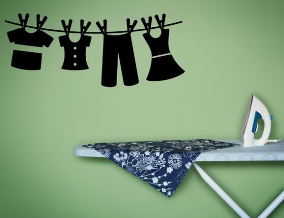
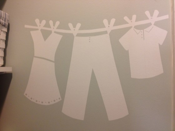
And for the final touch, some art! There are a lot of great ideas out there for laundry area art – vintage soap ads, wooden signs, etc.. I decided to do a simple wall decal. I’ve been hooked on decals since I did one in our nursery. Etsy has a lot of great ones with cute phrases, clothespin motifs, and more. I liked this laundry line decal and decided to try making one myself.
laundry decal

Adorable clothesline decal from Vinyl Wall Accents shop on Etsy. Click the picture to see all their designs and color options.

Go to shop on Etsy.

To make my decal, I cut a piece of white contact paper the size of the area I wanted to cover. On the back, I sketched my design. If you try this, remember that the finished decal will be a mirror image of your drawing – not an issue in this case, but definitely important if you are doing letters! Also, I freely disclose that I have never tried using contact paper to make a decal, and I’m not entirely sure that it is safe for the wall, but it is supposed to be removable, and from a quick browsing of the internet, it looks like other people have tried this, so I was willing to assume the risk (daredevil, I know!).

20120429-180901.jpg

To make your own decal from contact paper, sketch your design – in reverse – on the back of the paper. Then cut it out and hang!

laundry wall decal

I made the clothesline decal for our laundry area from white contact paper. It adds the perfect finishing touch!
decal

Close-up of the wall decal, cut out of white contact paper.

By the way, working on this area has made me think about a recent change to the laundry duties at our house.  I have been the main person doing laundry in our house (hubby more than makes up for it in the kitchen!), and it is a lot of work! Recently, our oldest, who is eight, asked if he could earn some money. He had just lost $6.50, most of his saved spending money, because I made him pay for his purchased lunch, the third time he forgot the one his dad packed (told you hubby more than makes up in the kitchen!).  So, what I saw was a win-win situation: I could be relieved of some laundry duties, while he could earn some spending money and also learn how to do laundry. The latter isn’t trivial – there was a boy in my freshman dorm who turned his bed sheets pink by washing them with some red clothes. Honestly, this doesn’t just happen in sitcoms; I saw it with my own eyes!

A small part of me feels a bit guilty about our kid doing our laundry to earn money, like when he mentioned the other day, “It seems like what is a lot of money to me is not a lot to you,” which is true. But overall, I think we have a great arrangement – my son gets to learn some domestic skills and earn spending money; I get more time to browse Pinterest and do projects for the blog. Okay, I’m (partially) kidding – I do also use some of the time to get ahead on other things around the house.  And, I never tell our son he has to do the laundry, but for now, he’s so excited about it that we have to stop him sometimes!

So, when you are thinking of home decorating ideas, don’t overlook your laundry area, no matter how small.  It’s a place where we all spend a lot of time, so I hope you got some inspiration to make your laundry area a pleasant place to be, too!

“Jewels”

New Powder Room from Top to Bottom – Wallpaper!

Our powder room facelift is going slowly… but surely!  Unfortunately, I started taking apart the space and then developed some inertia about getting the wallpaper up, as I hadn’t done wallpaper in a long time, so the sad state of this space got sadder before it started getting better.  Today, I put our toddler in daycare for an extra day, so I could go to Kindergarten Spring Sing at kids’ school without distraction.  After the performance – which was adorable! I took full advantage of the rare stretch of several hours “off” from both my office job and my mom job by having a lunch date with hubby and pledging to get this wallpaper up!

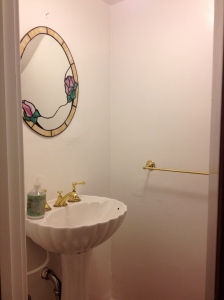
Vanity area before

BEFORE: The whole room was very white – blah – with dated gold-tone fixtures and a pedestal sink that has no room for storage or even the soap!

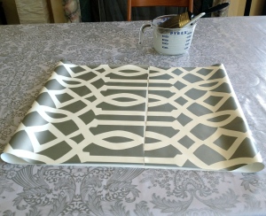
A powder room is a perfect place to use wallpaper – it makes a beautiful statement, without overwhelming you visually, financially, or logistically, as you only need a small amount.  I splurged big-time on the Imperial Trellis wallpaper in silver.  It was pricey, but I had enough to do the powder room, as well as line the backs of our living room bookcases.  I love the glow of the silver to brighten up our dark spaces.

Imperial Trellis wallpaper in silver by Schumacher. Click the picture to go their website for more information and colors.

I hung wallpaper once many years ago, so I remembered the basics, but I quickly refreshed myself with these instructions from This Old House.  Some of the planning steps did not apply to me, since I was doing such a small area.  I’m only hanging it above the (future) chair rail on one wall, because the ceiling slopes on the other walls (the powder room is under the stairs), and I thought the wallpaper on those walls would just draw attention to the changing ceiling line.

Here’s an overview of what I did:

Tools for wallpaper

TOOLS: From left, you’ll need
1. Squeegee: they make ones specifically for wallpapering, but a regular shower squeegee worked well for me.
2. Ruler or putty knife: to keep a straight line when trimming
3. Utility knife: for trimming paper at corners. Make sure it’s very sharp!
4. Pencil: for marking a plumb line.
5. Brush or roller: for applying wallpaper paste.
5. Wallpaper paste: mixed from a dry powder.
6. Sponge: for smoothing paper and wiping off excess paste.
Not shown: level or plumb line to mark a plumb starting line.

Booked wallpaper

After spreading the wallpaper pasted with a brush or roller, fold the paper as shown (called “booking”) for the adhesive to set.

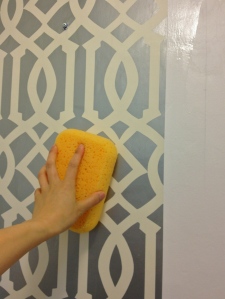
sponging wallpaper

Line the first piece up with a plumb line. Then, using first a damp sponge and then the squeegee, gently smooth the wallpaper from the center towards the edges to remove bubbles and excess paste.

Wow!  Wallpaper

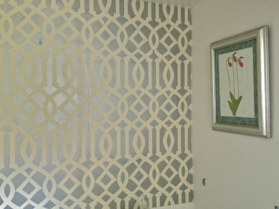
Wow! I was amazed at how the wallpaper made the room seem brighter and bigger. The silvery glow spread the light around the room, and the lines of the pattern made the space feel wider and taller.

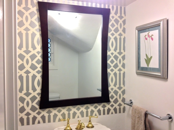
Once the wallpaper was up, I started adding a few accessories: a large mirror which, again, helps with spreading light around the small space, a new chrome towel bar, and some art that I pulled from a calendar (more examples of this great art in an upcoming post) and put into an frame found for a few dollars at Goodwill.  Again I used silver, to brighten up the room.

new mirror and towel bar

New mirror and towel bar added to the room. The “top” of our top-to-bottom facelift is done!

I am SO happy with the result so far.  It’s now a pleasure to enter this room that I had been avoiding!  What is the plan for the rest of the makeover?  I’m going to add a chair rail and paint the area below in a warm blue-grey, like this inspiring powder room by Sarah Richardson.  I’ve also got a new vanity going in to give us a little storage and counter space.  Hope to post the finished room here soon!

[UPDATE:  The powder room is finished!  You can see it here.]

An inspiration for our powder room. Click the image to go to the image on Sarah Richardson’s website.

And on a different note, what projects on the horizon have me all excited?  Check out these FREE chairs I am going to make over for my craft room/ office!  I can’t wait (though maybe I should finally finish the powder room first…)

Queen Anne Chairs - before

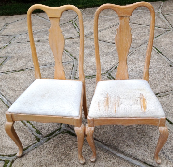
Sneak preview: A glamorous makeover is in store for these Queen Anne chairs I got for FREE through Craigslist.

“Jewels”