
My brain has a tendency to look at furniture and think, “What else could this be?” Our family has been on a journey this past year – we wanted to move houses, and logistically, it worked best for us to … Continue reading
My brain has a tendency to look at furniture and think, “What else could this be?” Our family has been on a journey this past year – we wanted to move houses, and logistically, it worked best for us to … Continue reading
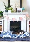
Between the start of school, two boys’ birthdays, and Halloween costumes, I’ll confess that many years I skip right over any fall decorating. This year, we are in the middle of moving, so I’m not sure how much decorating I’ll do.
But when I do decorate for fall, I’ve found you can create a lot of atmosphere with a few changes. I set the mood with some pumpkins and candles, creating something neutral yet festive.
Here are some of favorite pictures from years past. Projects seen in this post include


Here’s to crisp fall days!
Julie aka “Jewels”

I’ve channeling all the cozy winter feels for this holiday season (even if the California weather has other ideas!) To create a comfy atmosphere, my first project of the season was sewing these pillow covers from old sweaters. (More on … Continue reading
I’m not usually a big Valentine’s Day person, but then again, a holiday built around chocolate can’t be all bad! Anyway, a couple of weekends ago, I got the urge to make something – anything! – and I put together … Continue reading
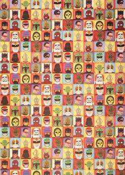
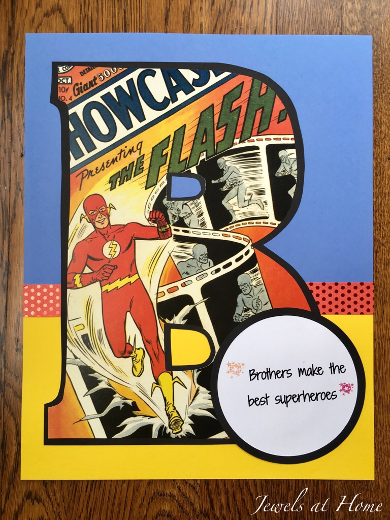
Superheroes have been capturing our imagination for decades, and the recent revival of superhero movies shows they are truly timeless. And since everything else with kids changes way too fast, superheroes make a great and enduring theme for their decor. I really enjoyed making these art projects for our kids and our friends’ boys.
My materials for the vintage superhero art were:
The calendar pages look great framed on their own. For our friends’ boys, I made these framed initials:


Looking for more superhero ideas? You may remember the covered mirrors and pencil tins I made a while back!
To infinity and beyond,
“Jewels”
I’ve decided to call my crafting style “serial crafting monogamy.” I definitely go on streaks where I fall in love with a new technique and can’t get enough of it. Right now, I’m sure you have noticed, I am addicted to macrame. Once I got the hang of it, I have so many ideas to try!
Today’s post is about adding color to your plant hangers – I did this with dyeing an ombre pattern as well as with adding colorful embroidery floss.
If you want to go back and see other posts on macrame, here are the links:
First, check out these beautiful ombré plant hangers. I made them with cotton clothesline and created the ombre pattern with navy fabric dye.


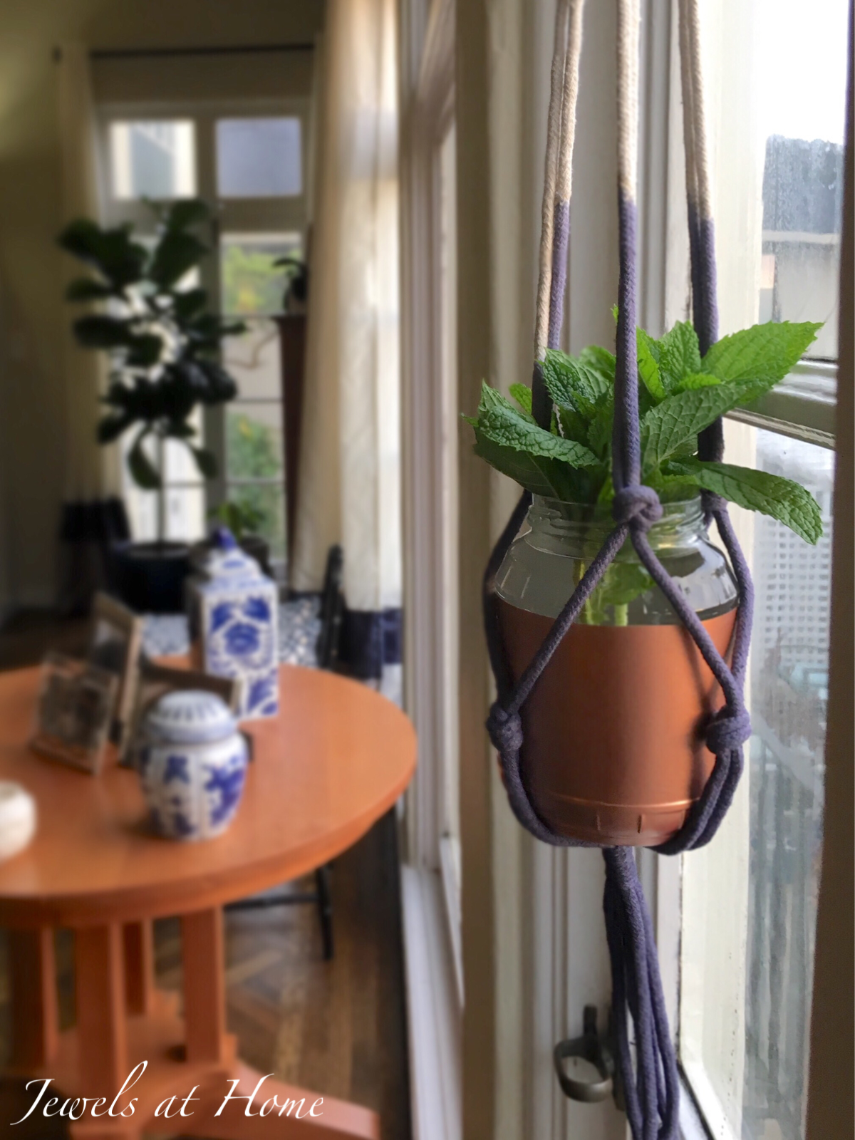
To get the ombré effect, I dipped the plant hanger in a container of dye solution and then pulled it out and hung it with just the bottom sitting in the dye for 20-30 minutes.
The other way I added color to the plant hangers was by adding gathering knots in different colors of embroidery floss.


And I just recently discovered Bobbiny cotton rope from Poland. It’s so soft, recycled, and beautiful, so I’m definitely scheming to add more color to my macrame projects that way!
“Jewels”

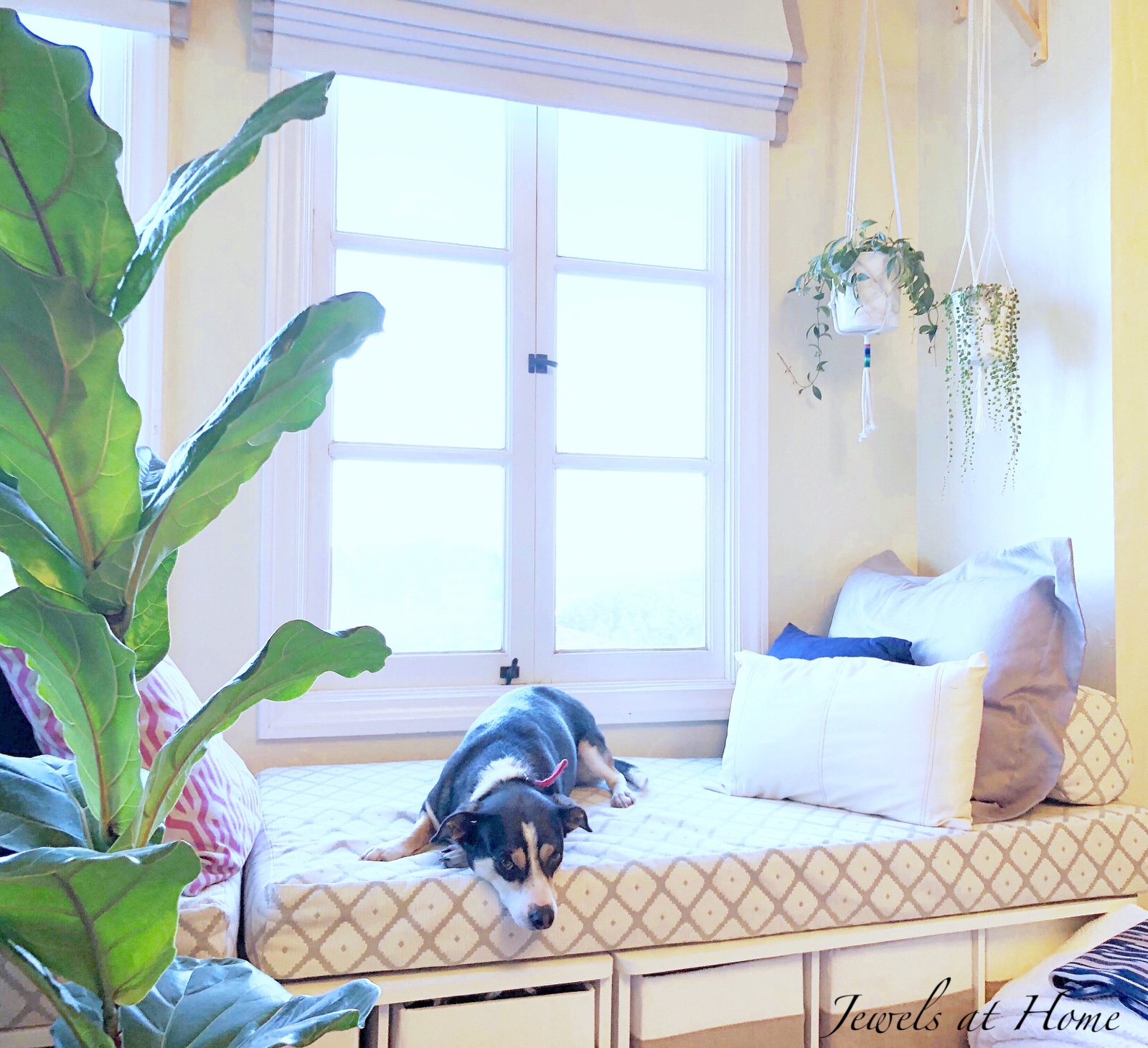
People often comment on the great light we get in our house. A lot of that has to do with the good fortune of big windows and a bright western exposure. But wherever you live, there are some tricks you … Continue reading
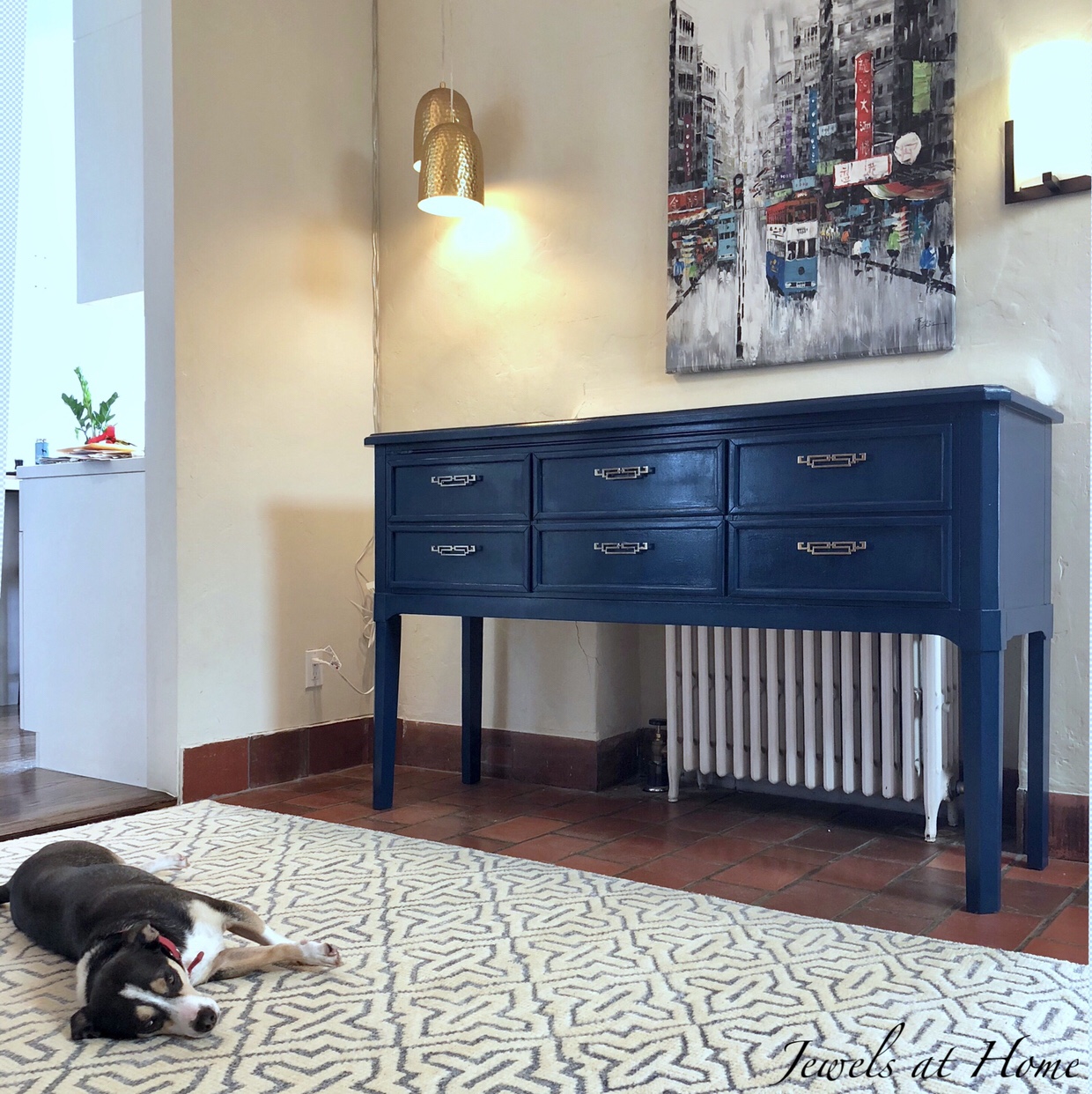
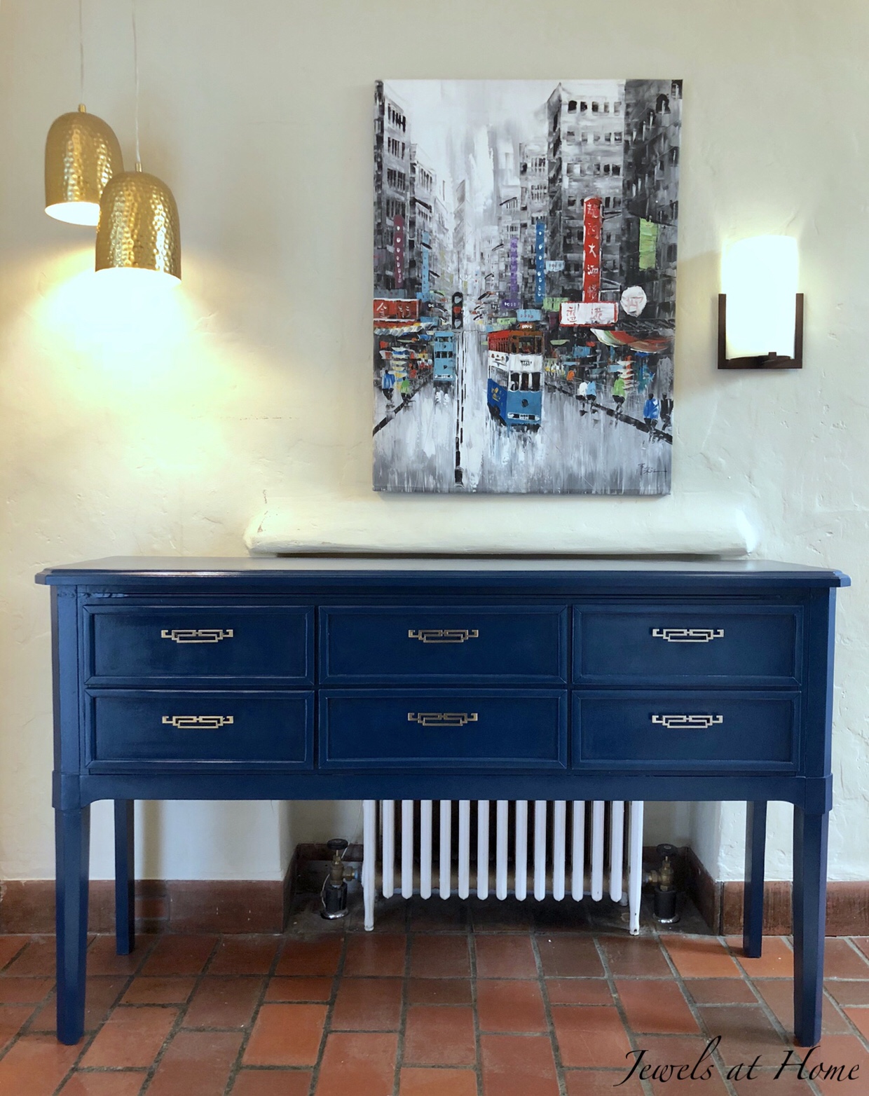
I’m decorating our foyer and wanted to feature a beautiful console table. While I found some already-finished options I liked, I needed something very specific to help disguise a radiator – but not block it off – so I decided to dive in and customize my own!

I knew I wanted the feel of a lacquered Chinese table, but I couldn’t find one in the right size and shape. I looked for something else with simple lines and hoped that with a few tweaks, some paint, and new hardware, I could pull off a transformation!
I started by assembling the sideboard except for the lower shelf. I wanted to leave the bottom open for baskets or stools. I had to fill in a few holes with wood filler. I also filled in the holes for the hardware and drilled new ones to match handles I bought on Etsy.
After sanding for a smooth finish, I started painting. I really debated the color choice, because the hall is already quite dark. In the end, I just knew I had to go with the color I loved and (with credit to Tim Gunn on Project Runway) make it work!

The navy paint is Nocturne by Behr, which I also used to repaint our master bath vanity. After painting, I added several coats of a glossy varnish, both to create shine as well as protect the finish.
My plan is to use some light-colored and neutral accessories to balance out the darker table.
Finn, the rug model, and the new console.


Can’t wait to see the whole space put together!
“Jewels”
Yes! You can use your dining room every day with kids! When I was little, like a lot of other families, we ate almost all our meals in the kitchen. Even though we had a dining room, it was reserved … Continue reading
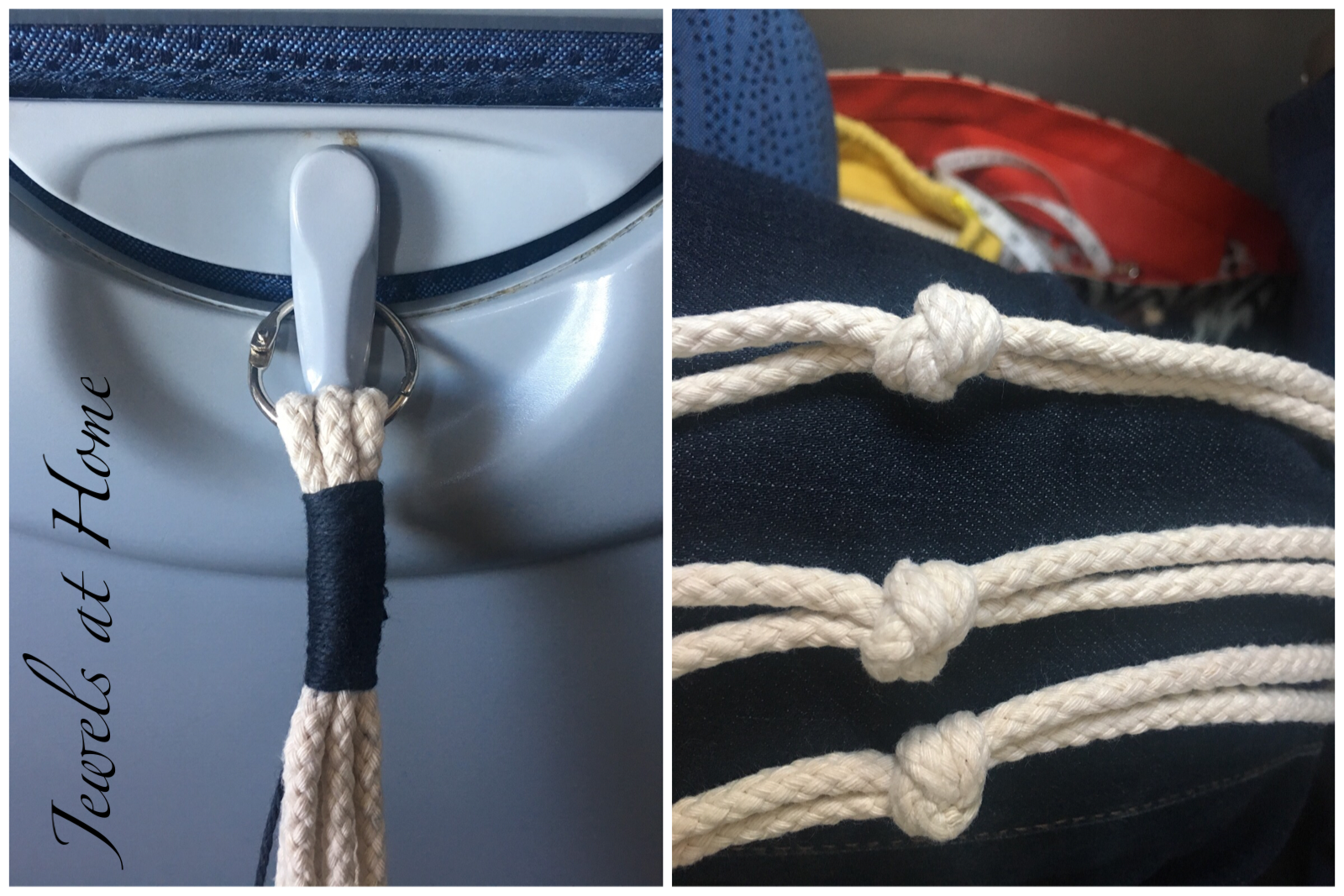
Everything old is new again! I’m visiting my dad and fantasizing about magically unearthing some old macrame projects from the 70s. Meanwhile, I’m trying my hand at making some plant hangers. This macrame obsession pairs perfectly with my newfound love of plants!

Tying knots in string shouldn’t be that complicated, but I was nervous getting started, so I chose the simplest project I could. Using some heavy cotton rope leftover from hanging a birthday piñata, I based my plant hanger off of these instructions.
Because the rope was so thick, I chose to use a gathering knot in blue cotton yarn rather than tie a heavy knot with the rope at the top and bottom.
Being a busy mom, the first chance I had to work on this project was on a plane! Luckily, the tab that holds up the tray table works perfectly for attaching the loop at the top;)
Here’s how the plant hanger looks empty:

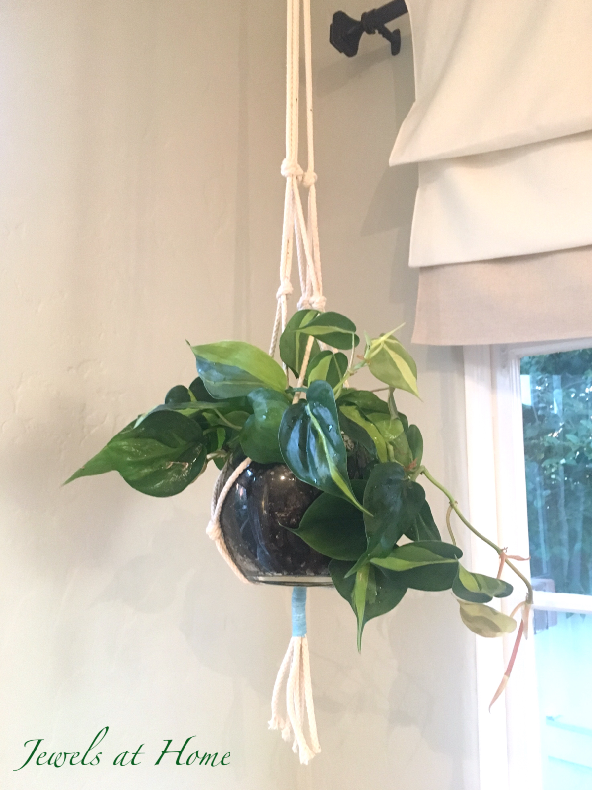
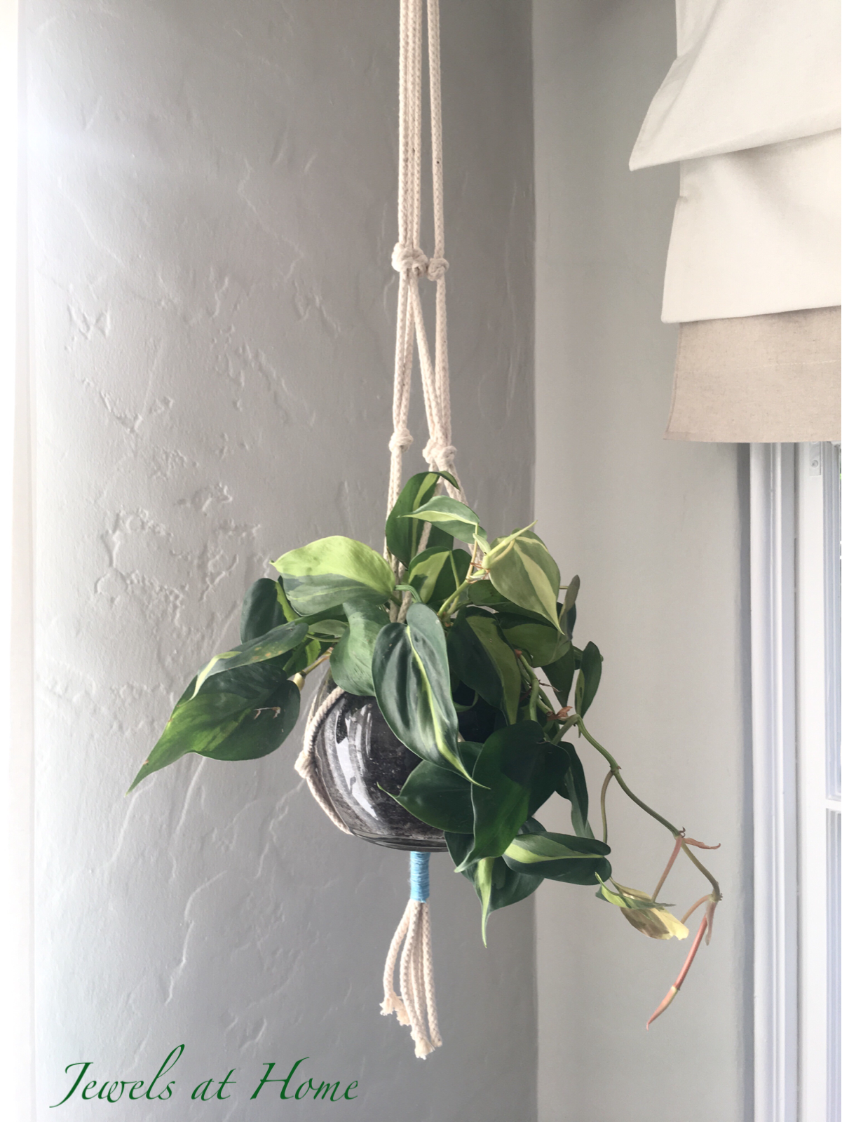
And here’s how it looks planted with Golden Pothos.

Stay groovy and green!
“Jewels”
